initial inspiration- pinterest board
https://uk.pinterest.com/stella9573/environment/
To start gathering inspiration for the project, I made a board on Pinterest. I plan to constantly update it throughout the project.
To start gathering inspiration for the project, I made a board on Pinterest. I plan to constantly update it throughout the project.
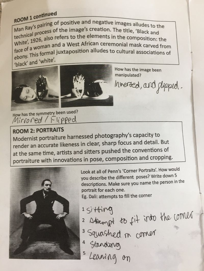
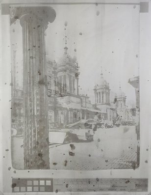
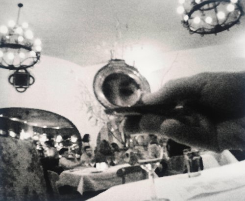
The Radical Eye: Modernist Photography from the Sir Elton John Collection focuses on the first half of the twentieth century, often referred to as photography’s ‘coming of age’. Artists at this time were transforming how photography was used and their experiments and innovations still impact how we see the world today.
We visited 'The Radical Eye', a photographic exhibition at the Tate Modern. It was a chance see one of the world’s greatest private collections of photography, drawn from the classic modernist period of the 1920s–50s.
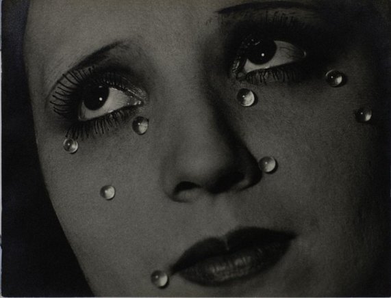
An incredible group of Man Ray portraits are exhibited together for the first time, having been brought together by Sir Elton John over the past twenty-five years, as well as other infamous photographic pieces. Below are some thoughts and analysis of key images.
We visited 'The Radical Eye', a photographic exhibition at the Tate Modern. It was a chance see one of the world’s greatest private collections of photography, drawn from the classic modernist period of the 1920s–50s.
An incredible group of Man Ray portraits are exhibited together for the first time, having been brought together by Sir Elton John over the past twenty-five years, as well as other infamous photographic pieces. Below are some thoughts and analysis of key images.
|
|
|
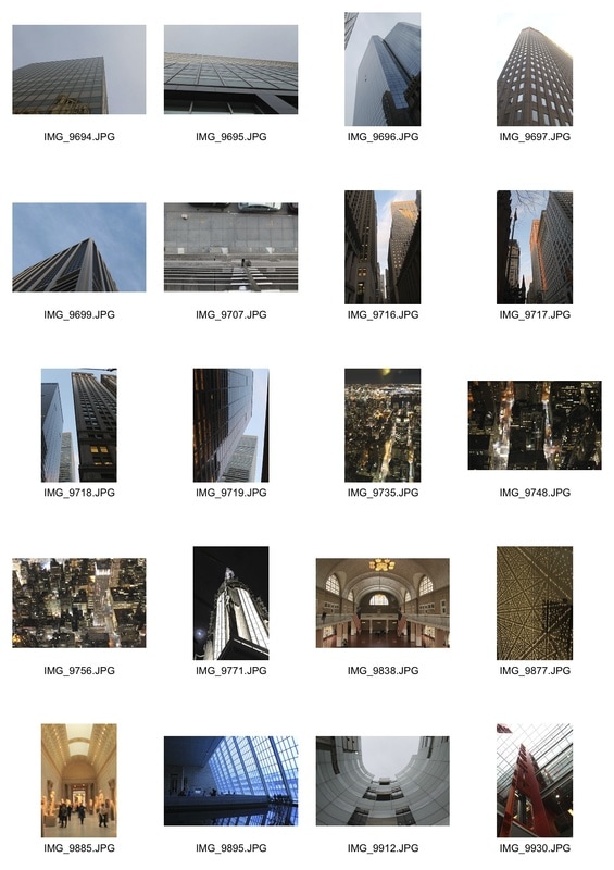
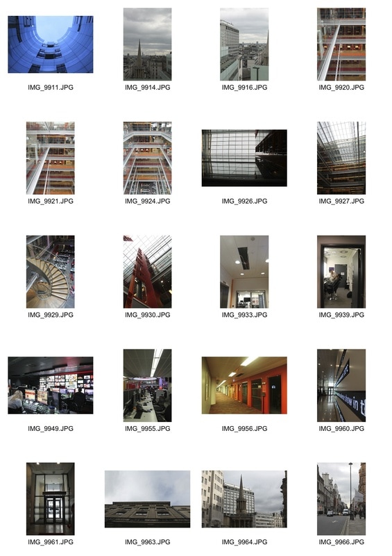
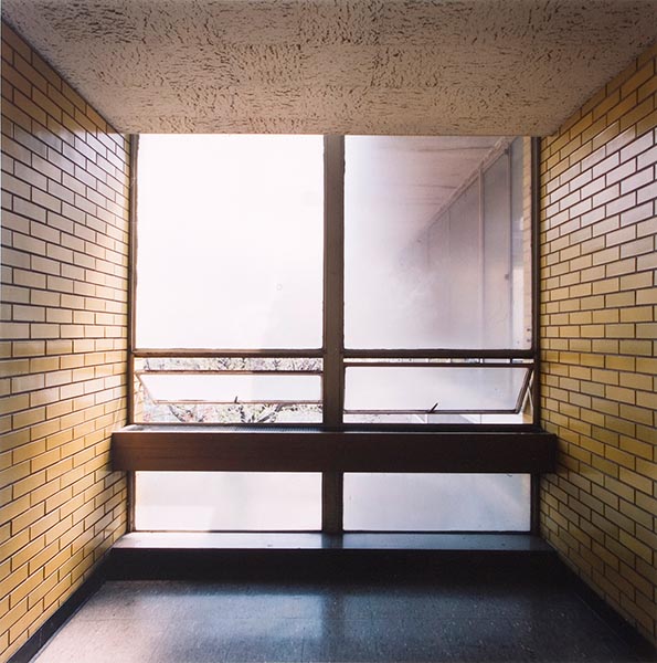
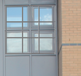
extreme perspective
Over the half term, I visited New York. Whilst there, I was struck by the height of all the buildings- they were much taller than in London and there were far more of them condensed into the same space. Walking the streets even felt a little claustrophobic. I took some pictures of extreme perspective from above and (mainly) below.
Back in London, I went into the city and tried to capture more perspective images. Since the buildings are nowhere near as high, I thought about other senses of perspective, like looking down a long corridor.
For both sets, I edited my favourite images in photoshop, adjusting the levels and brightness/contrast and saturation.
New York
London
people in their environment
As another approach to photographing 'environment', I captured people in their own environments. In London, this was at the BBC main broadcasting house. It was interesting to see the people at work, and how they became part of the environment as I photographed them.
In New York, I concentrated on people looking at their environment, and how they were detached but also included within it.
In New York, I concentrated on people looking at their environment, and how they were detached but also included within it.
London
New York
|
Whilst in New York, we visited the Metropolitan Museum of Art's photographic exhibition. They had some really interesting pieces that included an image that had been buried and dug up, and vivid documentary photography. Below are some of my favourites. |
|
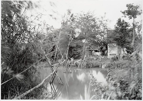
Dong Thap, Southern Vietnam, 1994
|
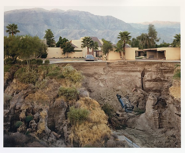
After a Flash Flood, Rancho Mirage, California, July 1979
|
|
Lê fled her native Saigon with her family in 1975, the final year of the Vietnam War, and eventually settled in the United States as a political refugee. After receiving her MFA in 1993, she returned to Vietnam to make poignant pictures such as this lyrical composition, which has the quality of a memory or dream in its blurred elements.
1691082u2 (Demolition of Madison Square Garden, 1925)
As a student at the University of California, Los Angeles, Brandt began exploring early photographic processes with the novel twist of using elements from his subjects as ingredients in the making of the prints. For example, he used the bodily fluids of his sitters to produce their images on salted paper prints. For the work on view here, the artist used dust swept from Madison Square Garden in New York instead of the pigments typically used in the gum bichromate process. By mixing particulate matter from the site into an image via a process that is itself a relic, Brandt makes his work of art into an animated stand-in for that which has disappeared.
|
Sternfeld's 1987 monograph 'American Prospects' succinctly captured the anxious mood that beset America between the Carter and Reagan presidencies. Its title refers ironically to the diminishing prospects-both physical and social-of the land that once symbolised boundless opportunity, in line with the American Dream. Sternfeld's style is subdued in the manner of New Topographics photographers Robert Adams and Lewis Baltz, and his borderline flatfooted approach perfectly suits the muted sense of apocalypse created at the time by nuclear meltdowns, hostage crises, and gas shortages in America.
After a Flash Flood is one of Sternfeld's most effective images, showing a cross-section of a society on the precipice of disaster. A razor-thin line separates order from chaos, as a typical suburban building complex seems to hover precariously over the maw of a recent mud slide that has swallowed a barely visible automobile. In the larger sense, Sternfeld's photograph is an early distillation of what the critic Mary Anne Doane described as "the culture of catastrophe," an idea that has flowered in the post-9/11 media moment into the basic structuring element of daily life: perpetual real-time monitoring of the world in anticipation of the next catastrophic event. |
empty public spaces
|
'In his photographs of institutional spaces, Fortino explores the psychology of confinement and protection. Observed with an almost clinical formality, his pictures of Chicago public school classrooms and police station holding cells, both highly structured and regimented environments normally filled to capacity, resonate through the absence of human presence.
Fortino works with methodical precision. By selecting scenes in which fields of colour and line flatten out space, he confines our attention to the interior details that the rooms’ occupants have left behind. Brightly coloured walls and graffiti evidence attempts to reverse the deadening and leveling affects of the bland institutional environments, as well as the very human need to assert independence and individuality in the face of restriction and impersonality.' |
|
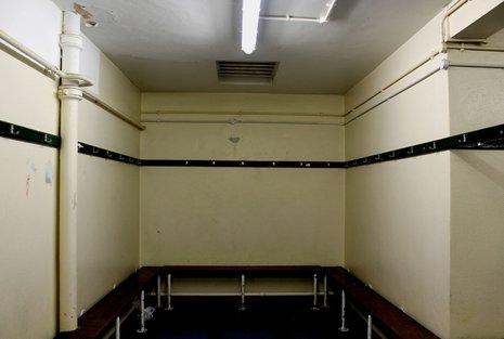
In class, I photographed around the school looking for empty spaces that were usually filled by students. We did it during lesson-time so that there would be no one about, but I think it would be more successful if done at night, after school closed. This would add a deeper sense of atmosphere and emptiness. However, I did find some empty spaces that felt eerie and abandoned. After picking my favourites, I edited them in Photoshop using the desaturating and levels tools to enhance their 'creepiness'. I feel this was successful: the edited outcomes had a much more striking effect. It felt almost sad and decrepid, and highlighted forgotten corners of the school- some of which are rarely visited.
|
|
artist & me
|

|
I chose to compare these two images as they are similar in composition, and have overlapping features. For example, both include a square wall as a point of perspective. They also include lines running through that, at a perpendicular. Furthermore, the bend is at a similar level in both images. However, they also differ from each other in many respects: whilst Fortino's wall is a window, mine is not. This subsequently alters the mood of the images as it depicts the light level. Whilst Fortino's is lighter, mine has a creepier, darker feel to it. This sense is enhanced by the 'ugly' strip of fluorescent light, adding to the sense of unease. Furthermore, although it is actually an outdated changing room, my image is reminiscent of a cell in its basic and practical design with no natural light and a barred opening. In contrast, Scott Fortino presents a (literally) lighter mood whilst still portraying the sense of emptiness. They also diverge in terms of compostition; mine is a typical landscape image whilst Fortino has cropped his into a square. This is effective as it emphasises the structure of the building and window, emphasising the feeling of being in a box, whereas a way out is suggested by the wider field photographed in mine.
development:
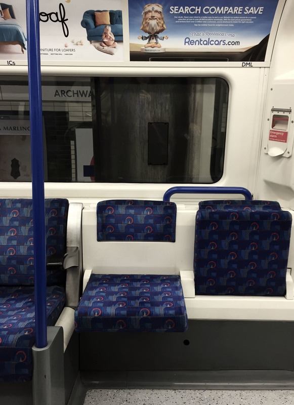
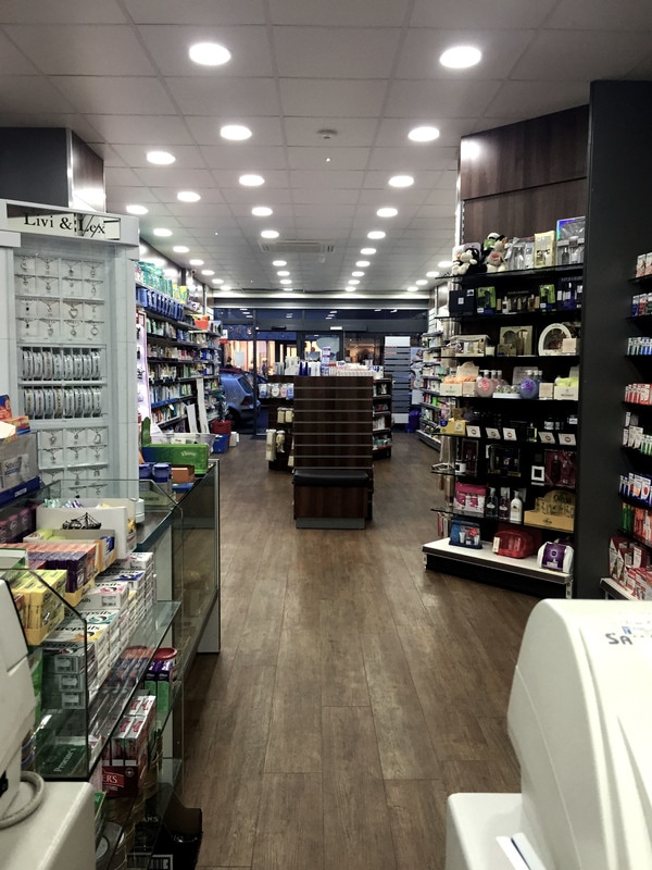
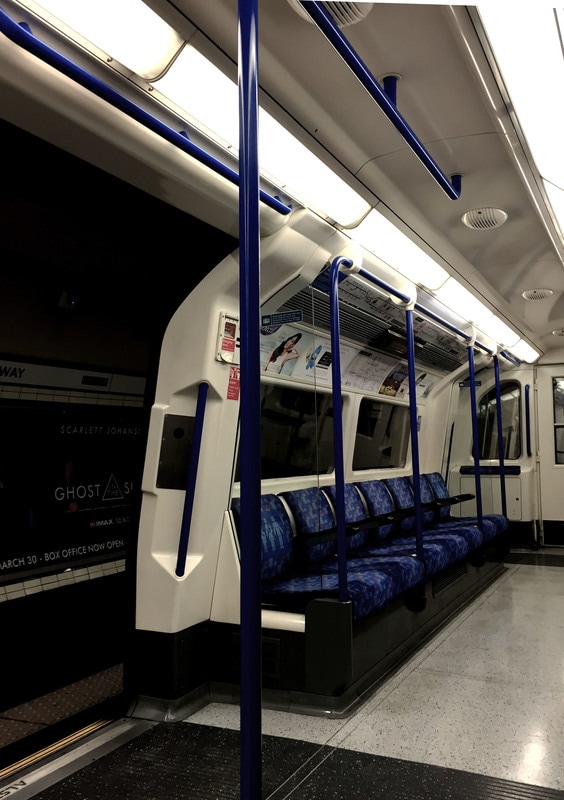
To develop this, I took photos on an empty tube carriage and in a shop. Normally busy and full of people, these environments feel odd and possess a sense of abandonment. Using photoshop, I tried to enhance this sense by desaturating the colours and vibrance. This made the light appear as even harsher, and they started to feel like institutions rather than everyday places.
|
|
After taking the images around school, I decided to see the effect of using different photographic techniques on the same pictures. I experimented with high contrast, dissecting elements of the image and imposing grids on to the image. I have outlined the process for each.
1. high contrast
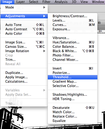
step 1: choose 'threshhold' in image adjustments
|
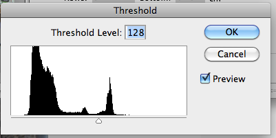
step 2: adjust the balance of black and white by changing the threshold level.
This produced some interesting effects as whole parts of the image were whited or blacked out. This method removed any mid-tones, fully exploiting the contrast in shades and creating new shapes.
It made the images more interesting but also more abstract: with whole elements removed, the structures took on new forms and shapes within their block colour. It removed familiar references and aged the image both visually and technically, adding a grain and old-style photography feel, remnant of photograms. To develop this further, taking pictures of more abstract subjects could confuse the image even more, making it entirely unrecognisable as a structure and entering further into the abstract genre. |
dissect
|
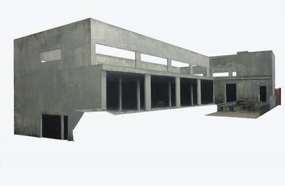
Patrick Cornillet is an artist who primarily experiments with dissecting and removing elements of an image. In this series, elements of architecture were taken out of their environment and reconstituted in the form of objects on a white background. Through doing this, he aimed to present the 'infinite nuances of concrete', and make us aware of the wealth (both physically and artistically) of the material or remains left by humans and the passing of time. Through making the architecture seem austere, spaces uninhabited and dehumanised, Cornillet creates 'a particular poetry and a mesmerising mysticism'.
My response to Cornillet's work is below. It was interesting to see how the dissection removed context, which highlighted the structure and shape of the subject. |
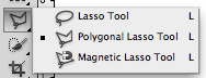
Step 1: selected the Lasso Tool
|
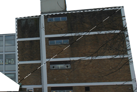
Step 2: drew around the building
|
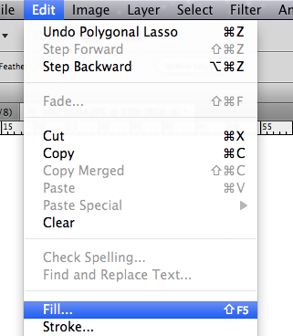
Step 3: Edit > Fill
|
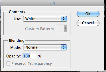
Step 4: changed the opacity to 100%, selected 'white'
|
GRID
|
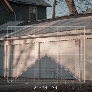
Nikki Graziano is a photographer and mathematician. Here she discusses the series on the left.
"Q: In your Found Function Series — are all your mathematical formulas correct? A: Yes, they’re all correct. One of them slipped by me for a while actually and I didn’t realise it was off until about a year later. I had copied the function down wrong and consequently typed it wrong. It’s fixed now though. It wasn’t intentional. I’ve never thought about playing with my audience like that. Although it is interesting how for that one that was wrong for a year no one even questioned it. Too much trust in images, perhaps. The images that don’t have formulas are the three-dimensional graphs. When I was making these I had originally put the function as text in there but it didn’t seem to click as well. The graphs were too graphic (no pun intended) as soon as they became three-dimensional, they sort of became part of the image rather than being a layer on top of it. The text was just an eyesore." |

step 1: select the shape tool
|
step 2: choose the grid
|
step 3: place the overlay on the image, adjusting colour, size and position to fit the structure
In response to Graziano, I experimented with overlaying grids and lines on my own images. The additions seemed to add a sense of order and organisation to the images, and the lines conformed to the structure in the image, creating different paths of direction when looking at it. It also had the effect of reducing everything to a formula or diagram. |
step 4: for one of my images, I transformed the grid to fit the frame in shot. I selecting Edit > Transform > Perspective
|
personal spaces
|
|
In the 1990s the BBC aired a documentary called Signs of the Times,' in collaboration with Nicholas Barker and Martin Parr. Directed by Barker, it was an early version of reality television and was seen as a fly-on-the-wall documentary combined with the celebrity show Through the Keyhole'.
An advertisement was placed in the British national and regional press asking for volunteers to be involved in the film. It was to be a show documenting the personal tastes of people in the British home. Two thousand people applied and fifty were chosen, from a range of ages, races, genders and social backgrounds.
Parr was asked by Barker to be the stills photographer on the shoot, and created a subsequent book to accompany the documentary. Each of the titles he and Barker gave the photographs are quotes from people in the film, which inadvertently send themselves up. Subtitled portrait of the nation's taste' these photographs give an insightful and amusing view of British taste in the 90s.
The titles of the images above are:
I GET SUCH PLEASURE FROM THEM EVERY DAY WHEN I SIT IN THE BATH,
THERE WASN'T ANYTHING HERE THAT HAD A FEMININE TOUCH. I BASICALLY MOVED IN AND PLONKED THINGS DOWN.
My Response:
To respond to Parr and Barker's work, I photographed different features in my house. It was interesting to view things that I walk past everyday in a new light, and highlighted different patterns and clusters within the house that had previously been overlooked as part of a bigger area.
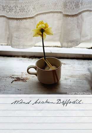
To explore comparisons, I also took pictures in Fred's house. It was brand new: his dad had just moved in. This meant that there was minimal furniture/objects in it. This added a sense of melancholy, or emptiness that was characterised by a bouquet of dying daffodils. It was intriguing to see the difference in a house that had been lived in for years and one that had been lived in just a few weeks, with only one inhabitant.
To explore comparisons, I also took pictures in Fred's house. It was brand new: his dad had just moved in. This meant that there was minimal furniture/objects in it. This added a sense of melancholy, or emptiness that was characterised by a bouquet of dying daffodils. It was intriguing to see the difference in a house that had been lived in for years and one that had been lived in just a few weeks, with only one inhabitant.
development: Fred's house
confined spaces
|
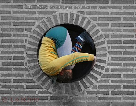
Austrian artist Willi Dorner squeezes human bodies into nooks and crannies for his Bodies in Urban Spaces project. Groups of dancers, climbers and performers wearing brightly coloured clothes run through busy shopping centres and high streets, cramming themselves into doorways, alcoves and any gap they can find in public buildings.
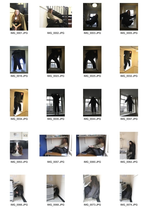
As a response to his work, I photographed my classmates squeezing into tight, confined spaces around the school. One location used was the attic which was dilapidated and had loads of corners to compress in to. Interestingly, the model's clothes matched the setting, adding an element of blending into the environment, or being forgotten in it. This was further suggested in their poses. 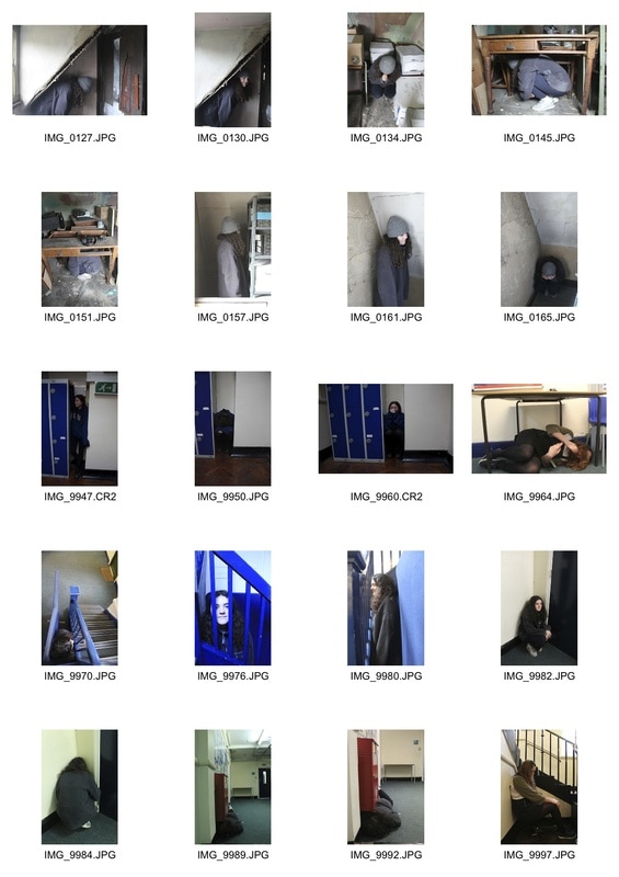
|
confined spaces: corner
|
|
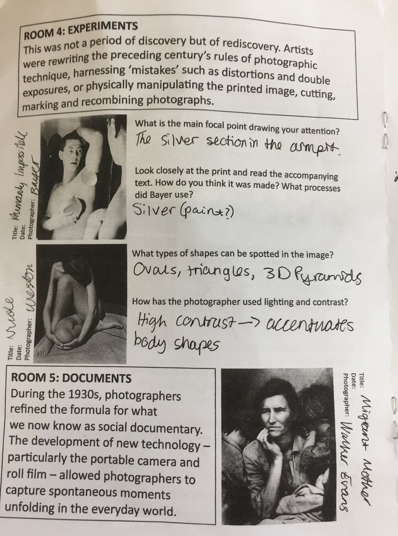
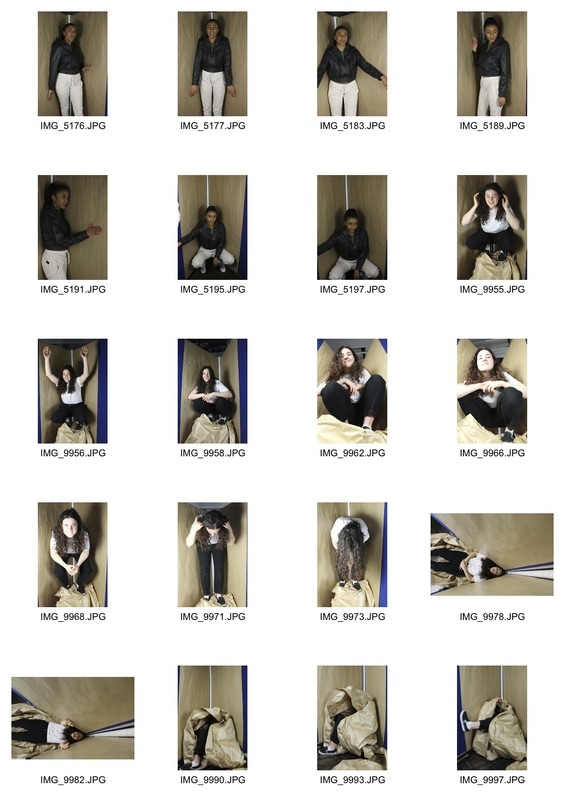
After seeing Penn's corner portraits in the Radical Eye exhibition, I was intrigued about his use of an environment to dictate the model and overall image. The pictures taken in the attic also reminded me of his work.
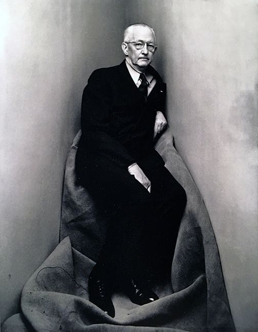
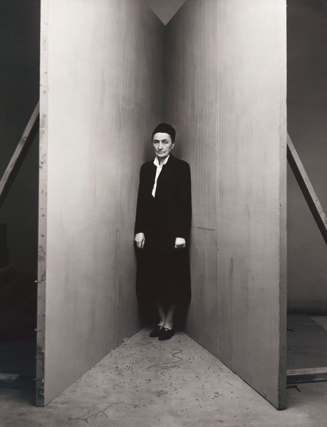
Around 1948, photographer Irving Penn began making unusual portraits of a number of writers, artists, musicians, politicians, dancers and other celebrities. Each one was asked to position in a small corner (sharper than 90°) created with two studio flats pushed together and a carpet on the floor.
The photographic studio was no longer a neutral environment but became an 'active agent in the creation of the photographic reality'. Irving Penn had already allowed the studio to have a presence in his images. In some of his other studio images we see electrical cables and photographic material scattered on the floor. In the portrait of Georgia O'Keefe (above) we see the supports for the corner flats.
Within the corner portraits, the studio becomes an architectural limiter of the subject movements and the resulting compressed and claustrophobic environment isolates the subjects’ personalities in an abstract, artificial corner of the world.
He once explained. “The walls were a surface to lean on or push against. For me the picture possibilities were interesting; limiting the subjects movements seemed to relieve me of part of the problem of holding onto them.”
In response to Penn's work, we recreated the corner and I photographed some of my classmates squeezed into it. They did whatever they felt comfortable doing in that corner. It was interesting to see how each person responded differently to the confined environment, choosing different poses. Choosing my favourites, I edited them in photoshop and made them black and white as to adhere to Penn's style; this removed the colour differences in paper and board and produced a more effective image.
restriction
|
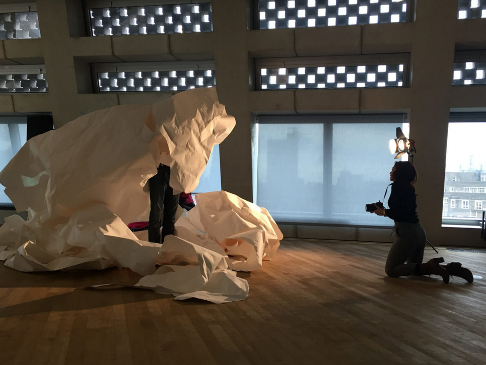
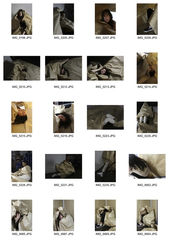
After visiting the Tate Exchange programme, I was inspired by their use of paper to create a new environment. In class, we tied to recreate this in the studio using brown paper. It was interesting to photograph different angles and different sections of the model within it. It became a restricting vice, providing interesting textures and shapes. 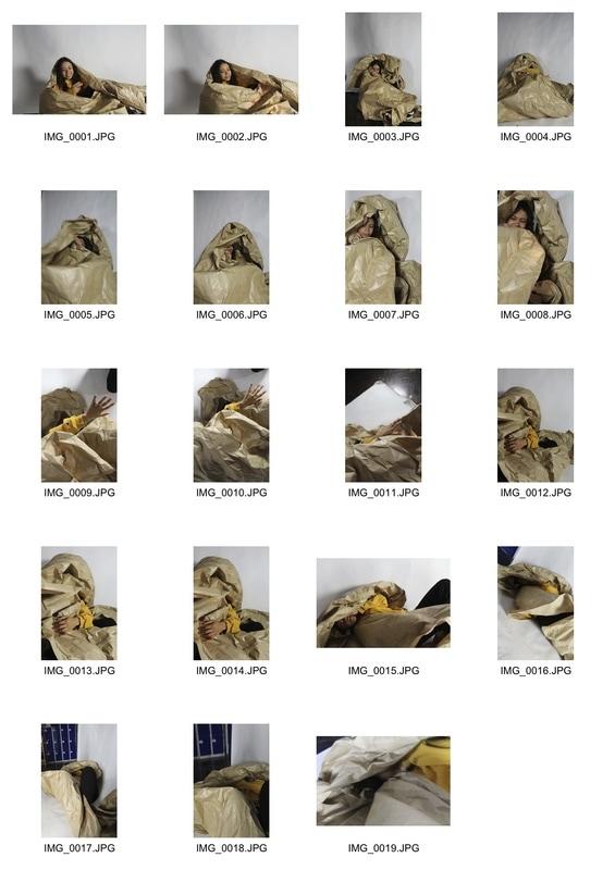
|
I like how these images could be from a fashion shoot, or something more abstract. The paper made visually interesting structures and introduced captivating textures. It was both a restricting agent and focal point for the images. Elements of the model which emerged from the paper were drawn attention to, which may have been overlooked.
constructed environments
|
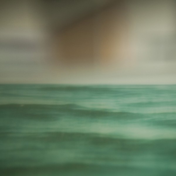
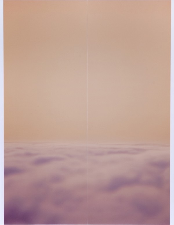
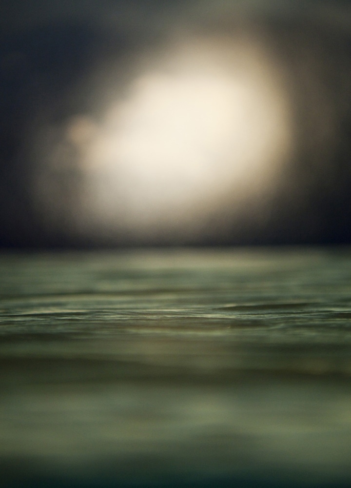
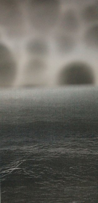
Aaron Farley is a photographer who manipulates physical images into a new environment. The original photographs are of water and clouds, and these are photographs of those photographs: turned on their side, moved, reshot, reprinted, cut and folded, and reassembled to create a different scene which still looks familiar.
|
|
my response:
To respond to Farley's images, I used block colour paper and found images of old and modern buildings juxtaposed with some shots of the sea, sky and more abstract structures. I cut and arranged them into new environments, and altered my depth of field to make them blend together in the style of Farley. I found the colour contrast particularly interesting as it provided a stark contrast both in colour and in detail to the architectural images.
artist & me
'Cloud Shines Bright' - Farley
|
|
Points of comparison can be drawn from both of these images. Most notably, they both feature a body of water (i.e, the ocean) and a brighter, sky section formed of clouds. Both sky elements are blurred, drawing the focus on to the water and holding the audience's attention. However, they also differ from each other in many ways. For example, Farley's image is in colour, whilst my response is in black and white. In some sense, this makes it more abstract as the overlapping greys can blend together more fluidly. I have also used a more surreal picture to make up the sky section, which is not immediately obvious as clouds out of context. Mine also looks flatter, as Farley's is positioned further away and makes greater use of depth of field. To improve, I would try and concentrate on adjusting the depth of field so that the 2 images blend together more successfully.
3 strands
To progress in my project, I am going to experiment with taking sets of observations under three strands: surveillance, spiritual, and forgotten / time-locked environments.
1. surveillance
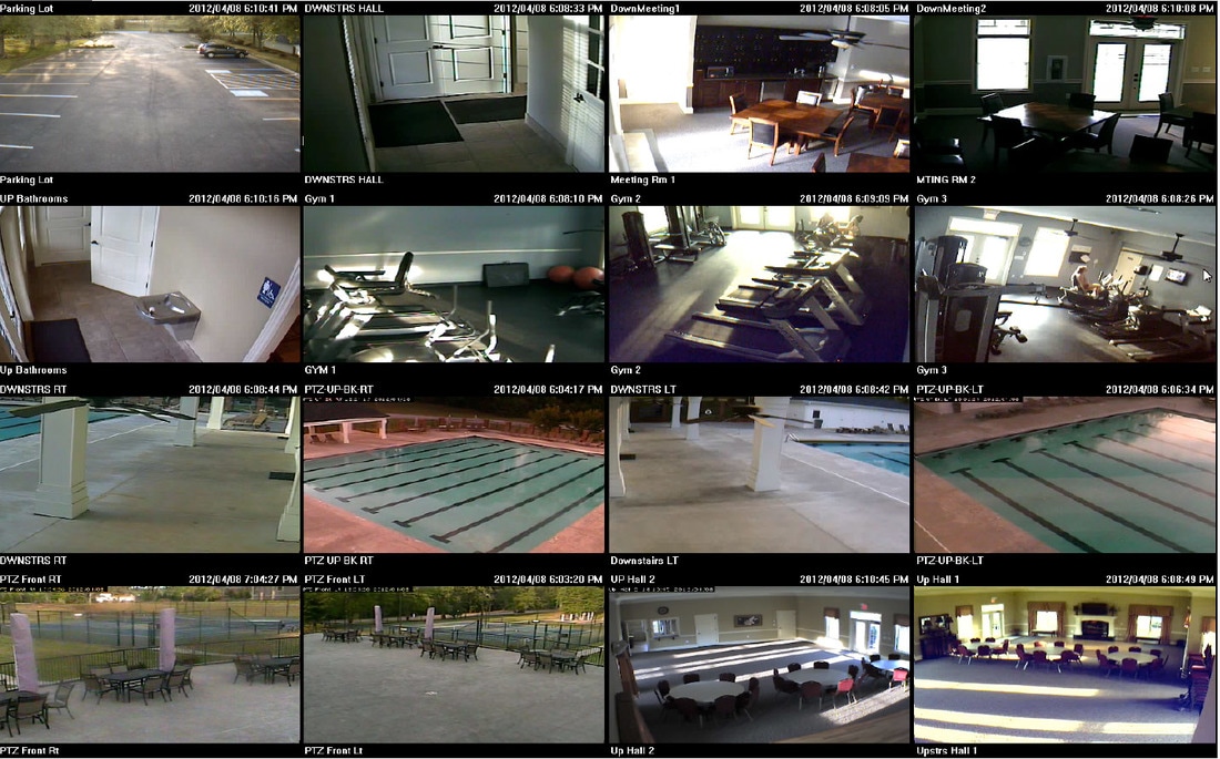
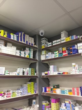
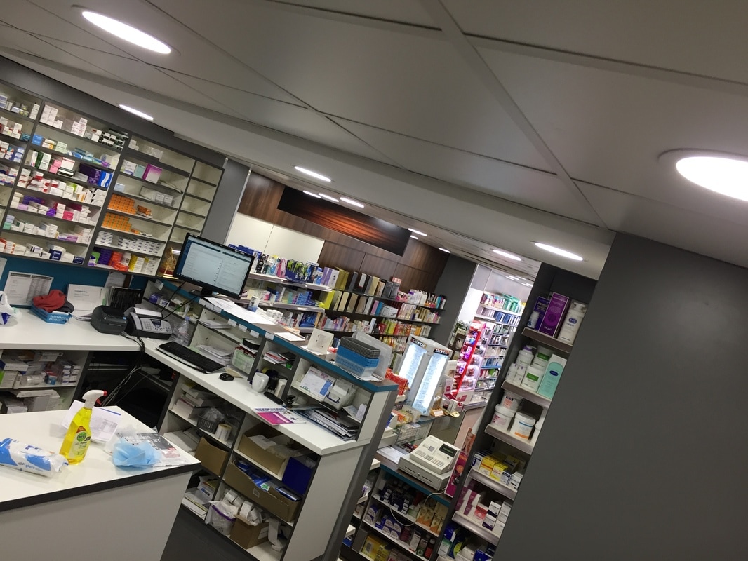
For my first strand, I want to explore the idea of surveillance photography. Although a wide subject field, the paths I find most interesting are the idea of covert surveillance (like photographing people without their knowledge), and looking at cctv monitoring. Within the latter, I find monitoring screens (where all the images feed into) visually intriguing.
Laurie Long
|
|
|
As a first response to 'surveillance', I photographed the seat opposite me on the tube. I tried to take an image at every stop of my journey, documenting who inhabited that designated 'environment'. At some of the stops the seat was empty, which exposed the seat and contributed to the overall series. It was an interesting study into how quickly an environment can change; every 3 minutes I would photograph something or someone different entirely. |
|
As a second response under the 'surveillance' strand, I took photos of the CCTV cameras in the pharmacy where I work, the monitor with all the camera feeds a shot of what the cameras would see, from their perspective. Below I have matched the camera with the angle that they'd see, and have put the other pictures of cameras and the monitor screen in too.

|
|
I found this approach interesting, as it suggested a more sinister side to photography, and made me realise how many security cameras there actually are that aren't normally noticed.This was only a small shop, yet had at least 6 cameras trained on it.
After photographing surveillance, I don't feel that I could progress much further within this topic and time constraint. Also, progression would be heavily dependent on the good will of independent shops in photographing and reviewing their security footage.
After photographing surveillance, I don't feel that I could progress much further within this topic and time constraint. Also, progression would be heavily dependent on the good will of independent shops in photographing and reviewing their security footage.
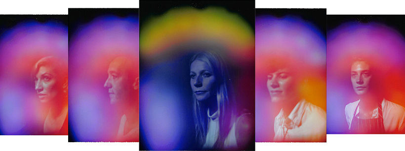
2. spiritual photography- auras
|
As my second strand, I wanted to explore spiritual photography. After seeing Dior experiment with aura photography at the recent London Fashion Week, I found it a really engaging concept and wanted to experiment with it. This concerned photographing something not immediately discernible to the human eye; using various photographic and scientific techniques to produce it.
An aura is described as 'the distinctive atmosphere or quality that seems to surround and be generated by a person, thing, or place', or in this case, (in spiritualism and some forms of alternative medicine) a supposed emanation surrounding the body of a living creature and regarded as an essential part of the individual. It shows a different kind of environment; arguably the model's own, usually undetectable one. However, after researching into this, I discovered that they are taken on specially built devices which are attached to metal plates that register your pulse, and only around 7 exist in the world. To get around this, I started thinking about creating a 'false' aura, using photoshop. To do this, I took pictures of my peers in the studio and used the brush tool in photoshop to create blocks/wisps of colour around them. I lowered the opacity to 30% to try and replicate the transient nature of the auras. |
|
Ultimately, although similarly interesting, they were not as effective as the actual aura photography. I feel that a black background would have enhanced the colours further, but that it would be hard to develop my project through this strand.
3. visually interesting / forgotten environments
|
Launderette / @alex_nevill from Alex Nevill on Vimeo. |
|
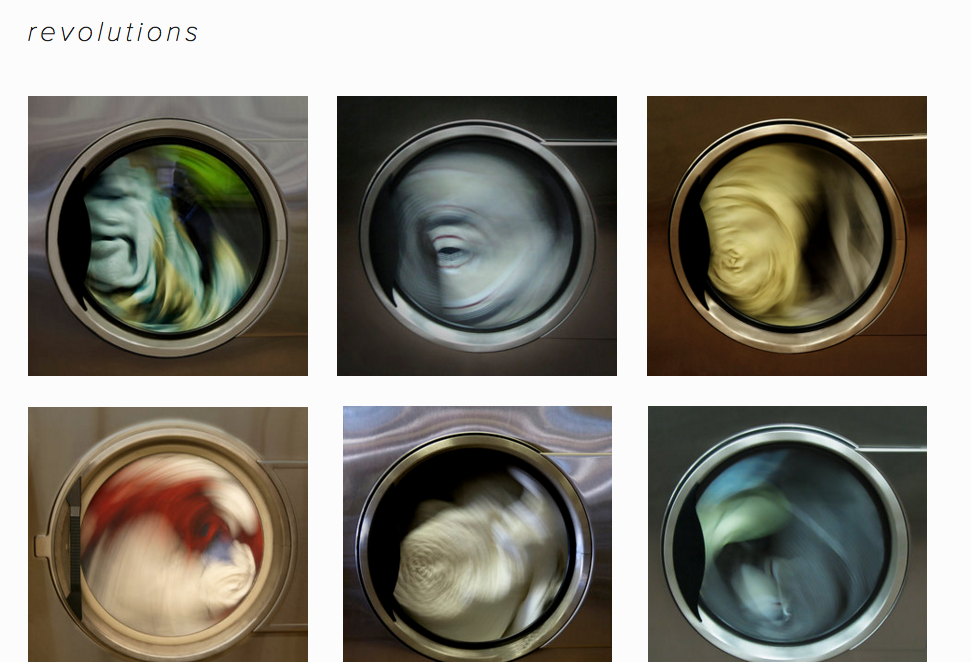
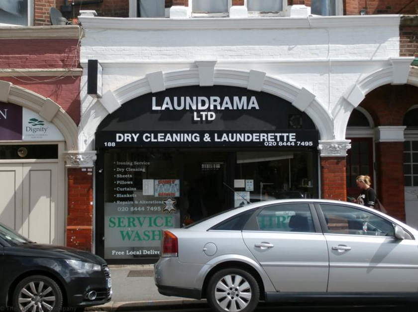
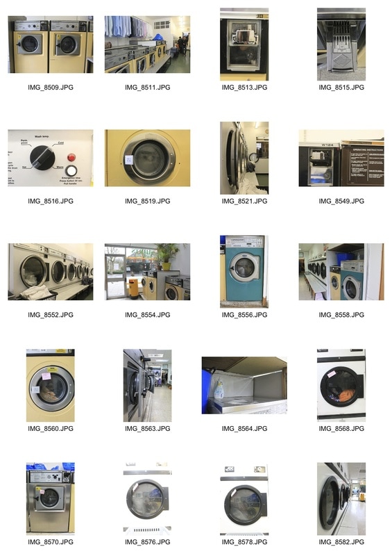
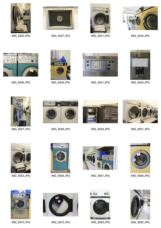
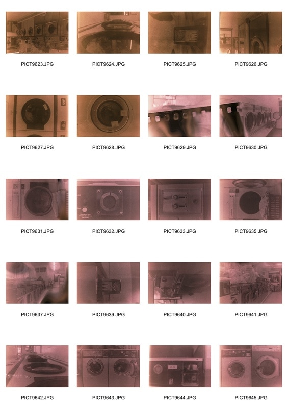
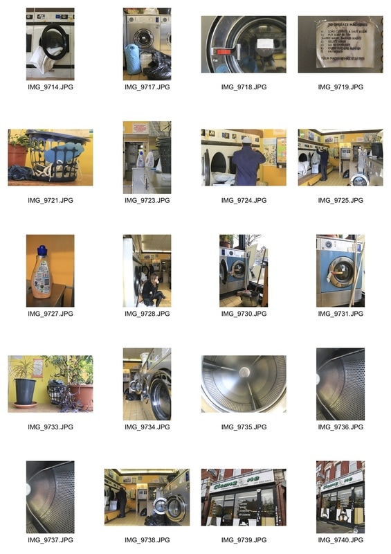
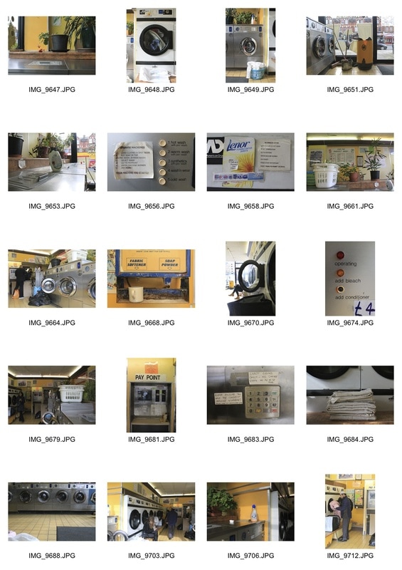
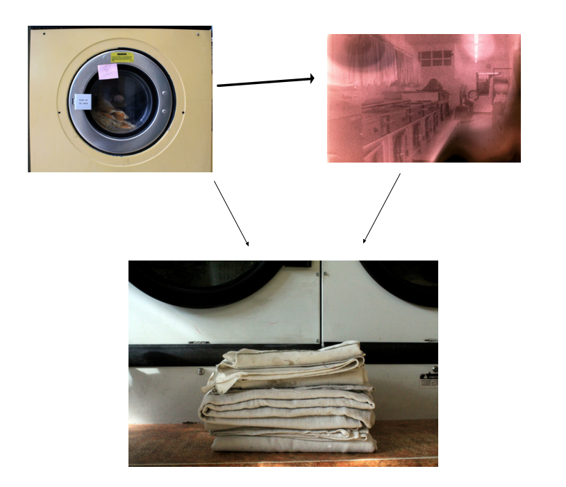
For my third strand, I started thinking about environments that I just find interesting, or have been wanting to photograph and explore. One that immediately stuck out to me was a launderette- they have a unique aesthetic and seem to be halted in time, decoratively and physically. They have been repeatedly used in fashion campaigns, TV programmes and even music videos as a setting which is visually appealing and something different.
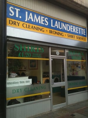
As a first response, I visited 2 launderettes with the aim of photographing the overall environment and examining the details of the shops. They were both empty, which made me wonder about their relevance in a modern society as a communal and personal space. I was struck by how they seemed to be stuck in the 20th century, which added to the shop's charm. Below I have detailed the locations of the launderettes and presented my selected shots which I edited on photoshop by desaturating them and adjusting the levels to increase the sense of melancholy/nostalgia.
As a first response, I visited 2 launderettes with the aim of photographing the overall environment and examining the details of the shops. They were both empty, which made me wonder about their relevance in a modern society as a communal and personal space. I was struck by how they seemed to be stuck in the 20th century, which added to the shop's charm. Below I have detailed the locations of the launderettes and presented my selected shots which I edited on photoshop by desaturating them and adjusting the levels to increase the sense of melancholy/nostalgia.
Laundrama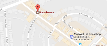
|
St. James Launderette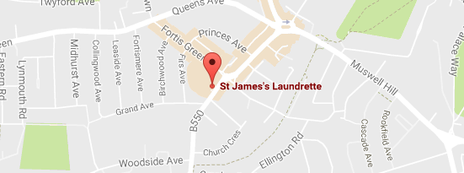
|
|
|
development: film
As well as photographing digitally, I took a film camera to capture the environment and details. I used black and white film as I felt this would contrast to the colourised digital images and offer a different interpretation to the same space. However, when scanning in the negatives, they appeared with a pink or orange filter hue, and were quite grainy. I liked this as it reminded me of the powder and grain of washing detergent, which was spilt all over both shops.
I also wanted to see them in black and white, so accurately adjusted the grayscale on photoshop to see this. Below is the process and final images in their original and decolourised forms.
I also wanted to see them in black and white, so accurately adjusted the grayscale on photoshop to see this. Below is the process and final images in their original and decolourised forms.
|
process:
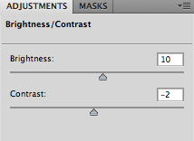
In Photoshop, I edited the brightness and contrast
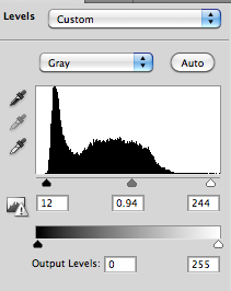
I then adjusted the levels to give a better exposure and light balance
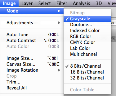
After saving the original, coloured ones I made them black and white by selecting 'grayscale'. I then repeated the above steps.
|
|
It was intriguing to see how changing the method of photography, on digital and film, altered the end result. Whilst the digital pictures show a more recognisable environment, the film produced a sort of cross-processed look that lent itself to a more physical process in making the images.
Moving forward, I want to go to more launderettes, photographing digitally. I liked the little details; the handwritten notes and signs which formed the shop's character.
Moving forward, I want to go to more launderettes, photographing digitally. I liked the little details; the handwritten notes and signs which formed the shop's character.
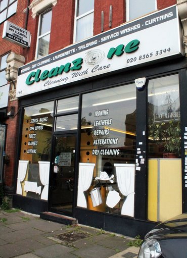
'Cleanzone'
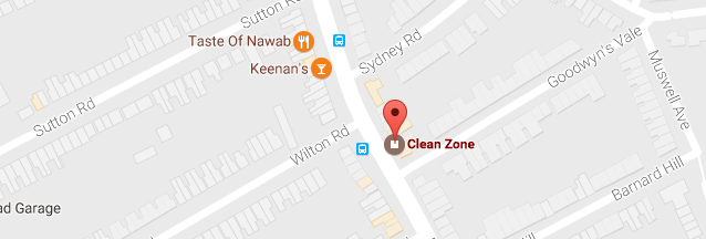
To develop this, I visited 'Cleanzone'. I wanted to see whether the location of the shop had any effect on their appearance. It is on Colney Hatch Lane, contrasting with the slightly richer Muswell Hill area. Perhaps as a result of this, or because of it's older age, this was the most interesting launderette I had visited so far: it had more character in its peeling signs, old powder dispensers and things lying around. There was also a customer in this one, which allowed me to view the environment 'in action'.
I was conscious of not wanting this set to be a replication of the last two I had visited, as they are very similar in appearance. To try and avoid this, I also tried photographing from more unusual angles and examining details in new ways, which I feel produced a more interesting set of images. |
|
|
|
In all, I feel these images were successful in capturing the 'forgotten' aesthetic of the numerous launderettes that still populate London. I focussed more on the individual details that contribute to the overall character of the environment. Moving forward, I want to capture the same sense in different types of shops.
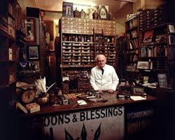

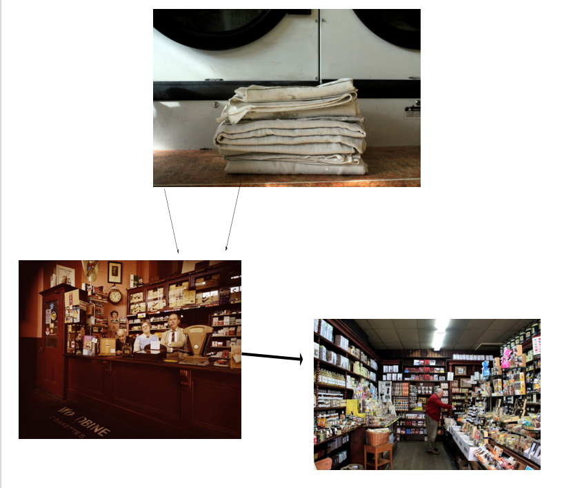
John Londei is a photographer who made a project on the decline of the traditional, small shop.
It was shot over a fifteen-year period beginning in the early 1970s, as a tribute to the traditional independent shops that once flourished in Britain. Londei captured 60 unique shops, ranging from family run grocery shops to traditional florists, tea and tobacco shops. The series covers many regions of the UK, from London to the Isle of Wight.
In addition to taking pictures of the shops, Londei has spoken to the shopkeepers who remembered a very different era. Speaking of it, one shopkeeper said:
"All the shops were incredibly well cared for and cherished and there was a real connection between the shop's identity and the people who ran them. I wanted to capture the sadness of the shops on their last legs."
In 2004 he began the task of updating what had become of the shopkeepers and their shops, and found that many had closed not long after the pictures were taken. This adds a sense of poignancy and melancholy to the already evocative images.
my response:
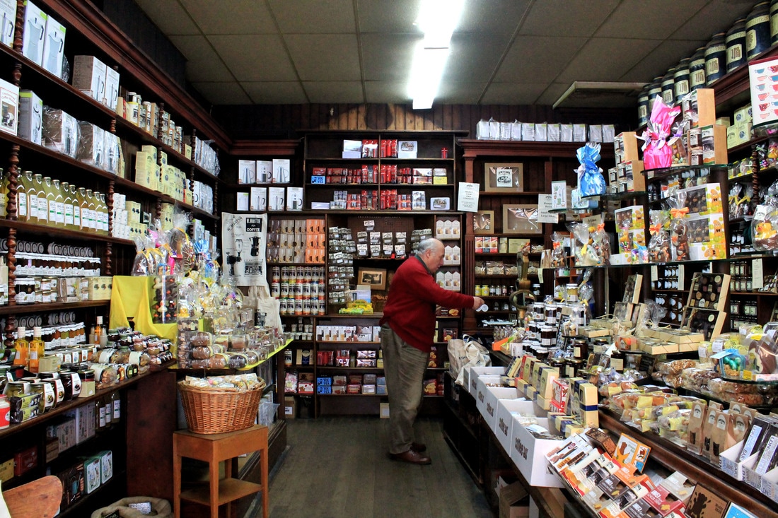
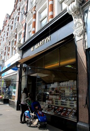
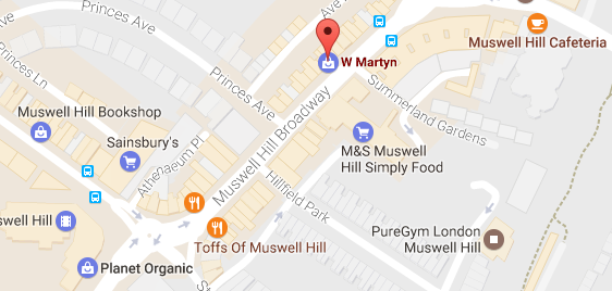
In response to Londei's work, and as a continuation of my project from the launderette pictures, I made a list of all the shops in one area that had character or were particularly old and well-established in the area and went to take pictures of them. These included W. Martyn, a coffee and condiment shop that has been there for at least 50 years, an antique jewellery and junk shop, and a barbers that had remained unchanged for 59 years. It was interesting to see that despite their being very few left, that there were still independent shops that were renowned in the area.
W.Martyn
|
|
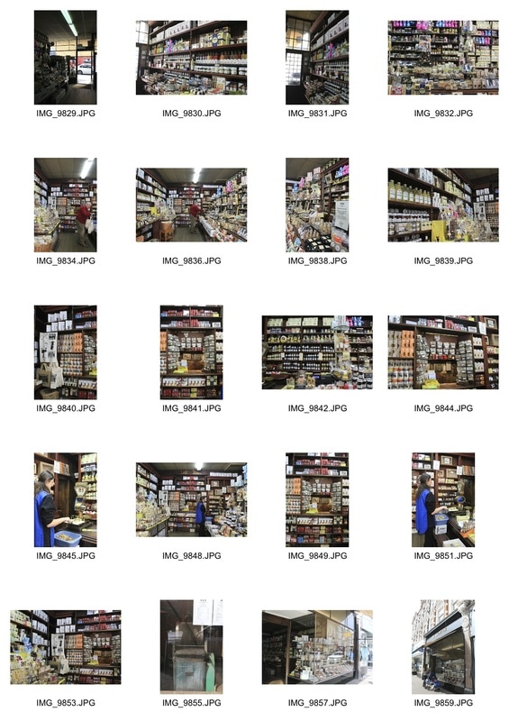
I was pleased with these images as I felt that they captured the character of the shop- the neatly ordered shelves and brown panelling particularly came through. They reminded me of some of the older shops within Londei's project that shared the same brown wood walls.
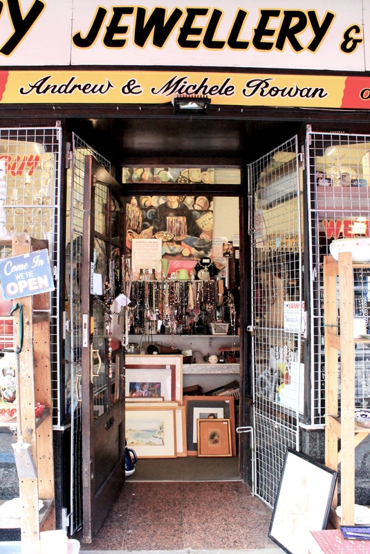
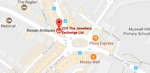
Antique Jewellers
|
|
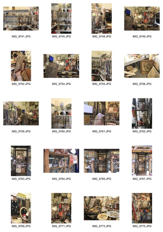
I chose to visit this antiques shop as whenever I'd glimpsed into it I had been struck by the sheer amount of items, and their apparent randomness. When entering, the volume and placement of all the products was overwhelming: it felt almost like a jumble sale / junk shop. Interestingly, the owner of the shop (who refused to be photographed) seemed to know where everything was, and was able to pull a specific silver pendant from a tangled pile of around 50 very quickly. His knowledge and attachment to the shop really came through, and I thought that the superficial 'mess' it may have been a reflection of his mind.
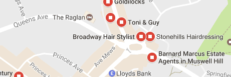
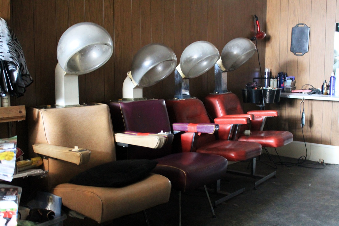
Broadway Hair Stylist
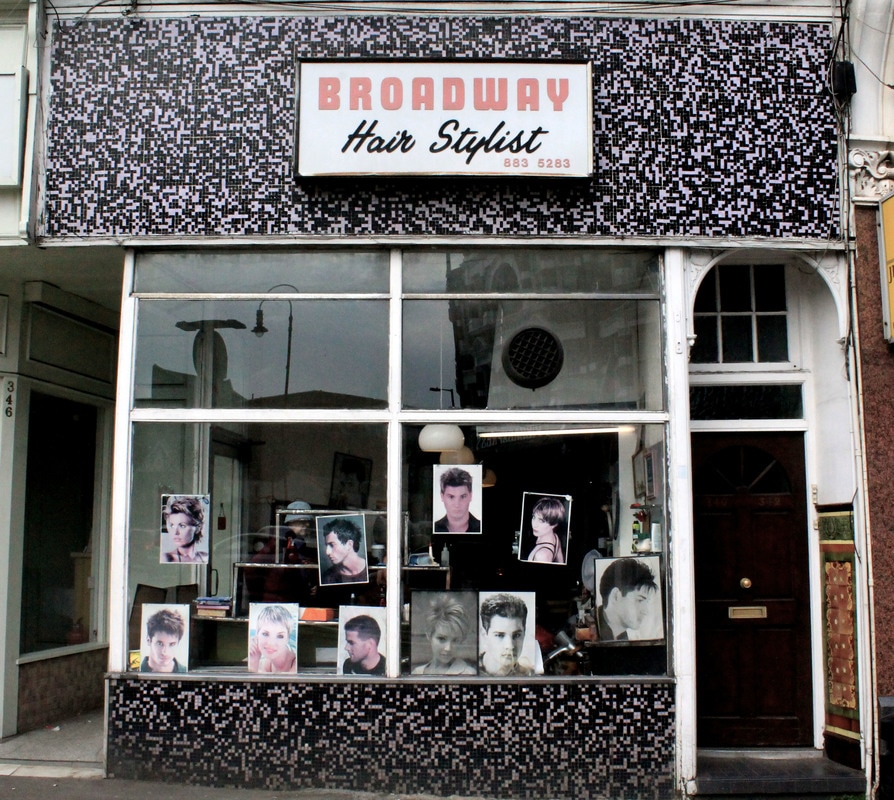
|
|
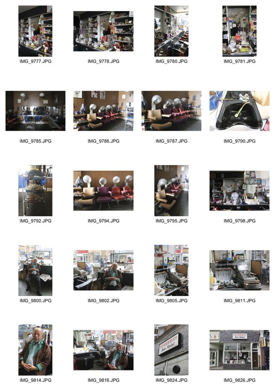
Lastly, I visited 'Broadway Hair Stylist', a barbershop that I came to discover had been opened (and unchanged) since 1959. It was full of character: there were combs/scissors/various utensils crammed on every shelf and available workspace, despite the lack of customers. When stepping in, it truly felt like stepping back in time: there were no signs of anything from this century. I also discovered a back room with classic art-deco / 1970s hairdressing chairs that the owner, Micheal, informed me was the woman's section of the salon. This was in near darkness, and looked unused for a long while.
As a development from my previous observations, I wanted to photograph the shop owner/ keeper to see if they had any influence on the environment (or if the environment had physically influenced them). I took some portraits of Michael and talked to him about his shop. He told me that he'd owned it for nearly 60 years, and had opened it as a young immigrant to London in the 50s. This was interesting as it added a new element of personalisation to the images. I want to bring this forward in my next few sets as I continue documenting established shops.
As a development from my previous observations, I wanted to photograph the shop owner/ keeper to see if they had any influence on the environment (or if the environment had physically influenced them). I took some portraits of Michael and talked to him about his shop. He told me that he'd owned it for nearly 60 years, and had opened it as a young immigrant to London in the 50s. This was interesting as it added a new element of personalisation to the images. I want to bring this forward in my next few sets as I continue documenting established shops.
visual progress map
|
|
La Boqueria
|
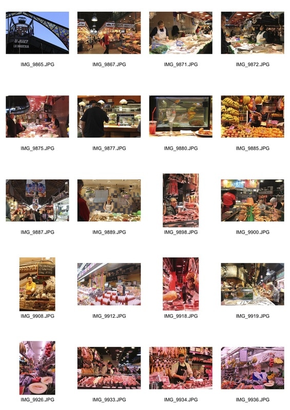
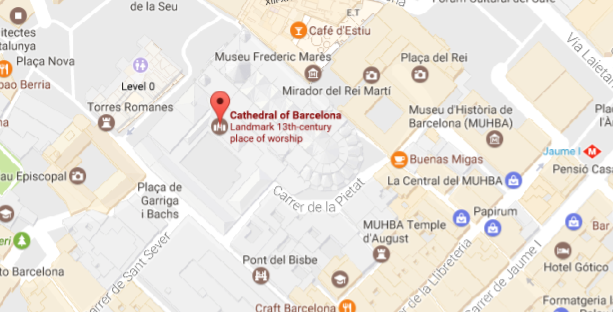
To develop this idea, I visited La Boqueria in Barcelona. This is a traditional food market, dating back to as early as 1217. Although it has undoubtedly changed since then, it was a place steeped in history and culture, and so I tried to capture this.
When photographing, I thought more about Londei's work in that he often shot the worker, and I liked the sense of personalisation that emerged from my previous shots of Micheal the barber. I thus tried to focus on the stall owners as well as their overall environment (their stall). It was interesting to see the sheer volume of stalls available, and how each formed a unique, mini-environment within the large market. |
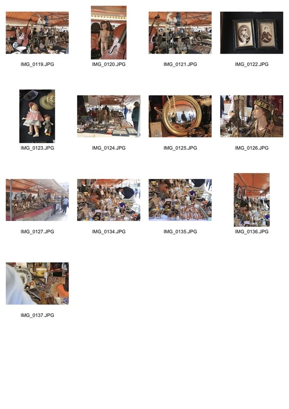
Mercado Catedral
|
I also researched and visited the Mercado Catedral, an old trinket market in the heart of Barcelona's barrio gotic. This was interesting as there was so much seemingly random stuff, including cellos, Victorian dolls and anonymous Victorian portraits.
Since many of the stallkeepers were absent for this set, I focussed on the details of the stalls, aiming to capture the market's character. It felt as if it were of another era. |
Photographing in Barcelona was interesting as it showed a different culture and a foreign, old / established environment. The markets were open air which differed from the closed, indoor spaces in London.
As a tourist, I did not have a good enough knowledge of the city to find and photograph forgotten or old spaces that weren't famous or easily accessible. In London I do, so I plan to brainstorm and visit more of these.
As a tourist, I did not have a good enough knowledge of the city to find and photograph forgotten or old spaces that weren't famous or easily accessible. In London I do, so I plan to brainstorm and visit more of these.
|
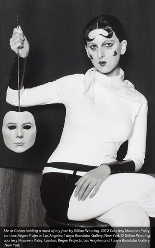
This exhibition brings together for the first time the work of French artist Claude Cahun and British contemporary artist Gillian Wearing. Although they were born almost seventy years apart and came from different backgrounds, remarkable parallels can be drawn between the two artists. Both of them share a fascination with the self-portrait and use the self-image, through the medium of photography, to explore themes around identity and gender, which is often played out through masquerade and performance.
I thought that this linked to my project in the shared exploration of 'timelessness'. Despite Wearing working in a completely different era, she was able to accurately replicate and find commonality with Cahun's work. Somewhat similarly, my project examines the time-gap/ time-warp of many forgotten shops in a modern day city, suggesting a sense of timelessness from the old shops that still exist. It interested me in that the theme of timelessness can be translated in different genres of photography; here in portraiture, and within mine as documentary. |
|
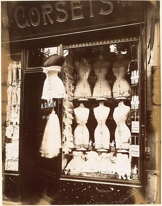
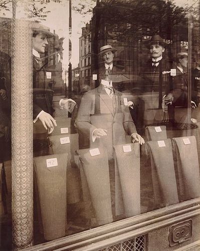
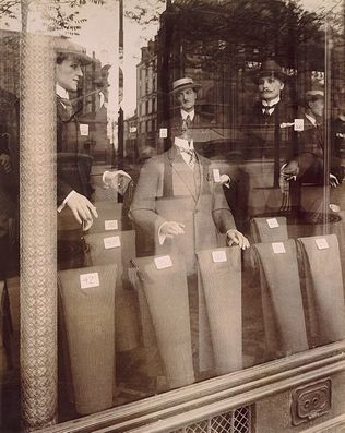
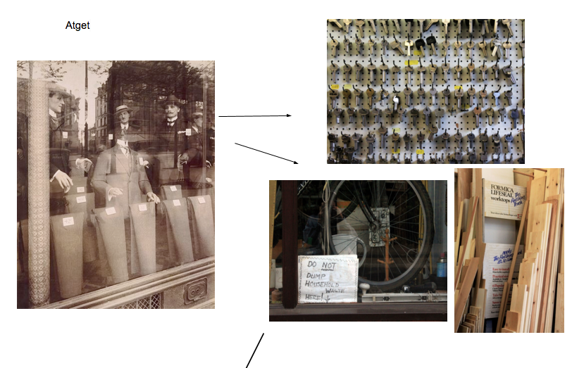
Atget found his vocation in photography in 1897 at the age of 40, after having been a merchant seaman, a minor actor, and a painter. He became obsessed with making what he termed "documents for artists" of Paris and its environment; compiling a visual collection of the architecture, landscape, and artefacts that distinguish French culture and history. By the end of his life, Atget had amassed an archive of more than eight thousand negatives, which he organised into categories such as Parisian Interiors, Vehicles in Paris, and Petits Métiers (trades and professions). In the latter, Atget composed an inventory of Paris shop windows. In the 1920s the Surrealists recognised in Atget a kindred spirit and reproduced a number of his photographs in their journals and reviews. This was mainly due to their surreal nature in the mannequins and reflections formed on the window. Antiquated mannequins such as the ones depicted here struck them as haunting, dreamlike analogues to the human form. Atget's images relate to my work in their shared exploration of shops, and specifically shop windows. They also relate in their intention of capturing a 'forgotten' or lost sense in the city, which I have been trying to capture in visiting the unusual, forgotten environments of London. Interestingly, Atget was photographing on the eve of a period of major re- industrialisation in Paris, adding a sense of nostalgia and poignancy to the context of his images. |
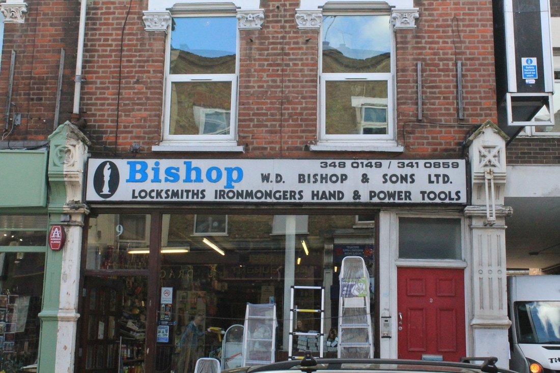
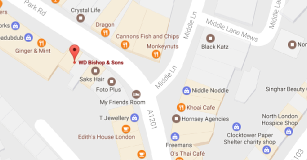
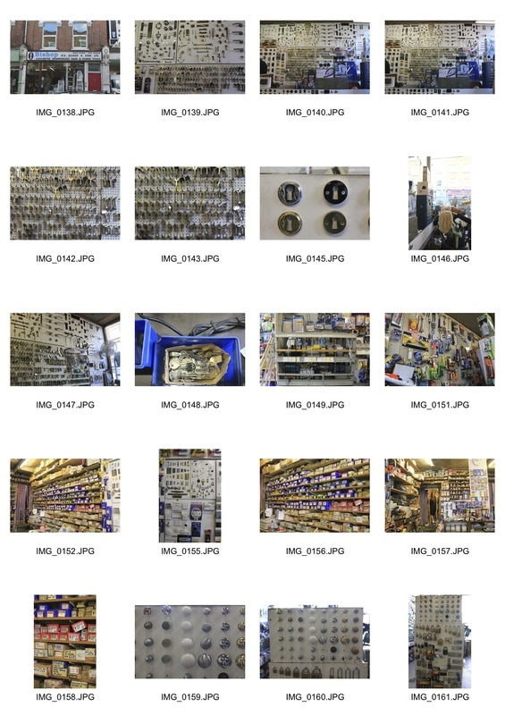
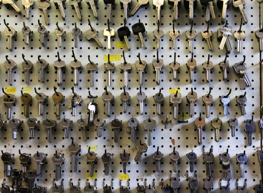
Locksmith
Returning to London, I began brainstorming and asking around before compiling a new list of shops that are visually interesting and old, or are unusual. The first one I visited was a locksmith / ironmongers, which appealed to me because of the volume of keys and boxes and the unique aesthetic this provided. They made up a visually intriguing environment. The long boxes were piled high and almost reminiscent of a Harry Potter set. Despite the seemingly unorganised nature of the shop, the shopkeepers were able to accurately locate everything that any customer asked for. This was indicative of their long, engrained knowledge as long-established shopkeepers.
|
|
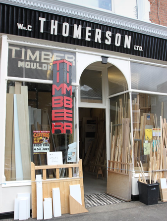
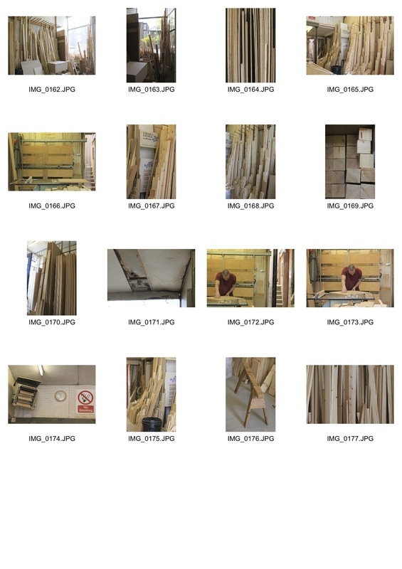
wood workshop
As another unusual environment, I visited WC Thomerson, a local wood workshop. This was interesting as it was not a traditional shop, as Londei or Atget photograph, but more of a working environment like the launderettes which I initially started my project with.
|
|
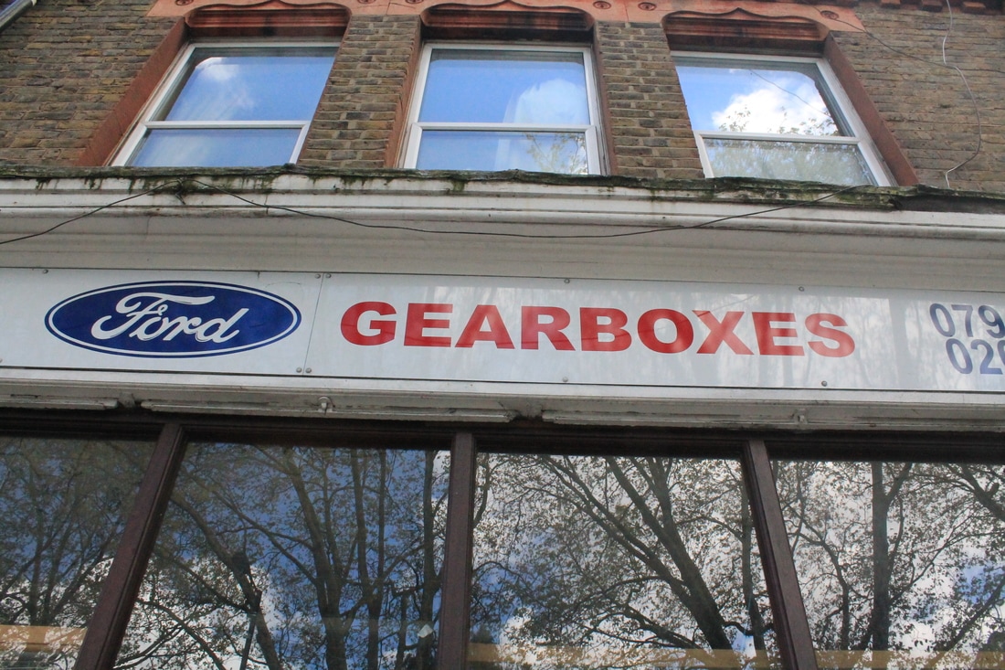
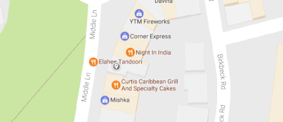
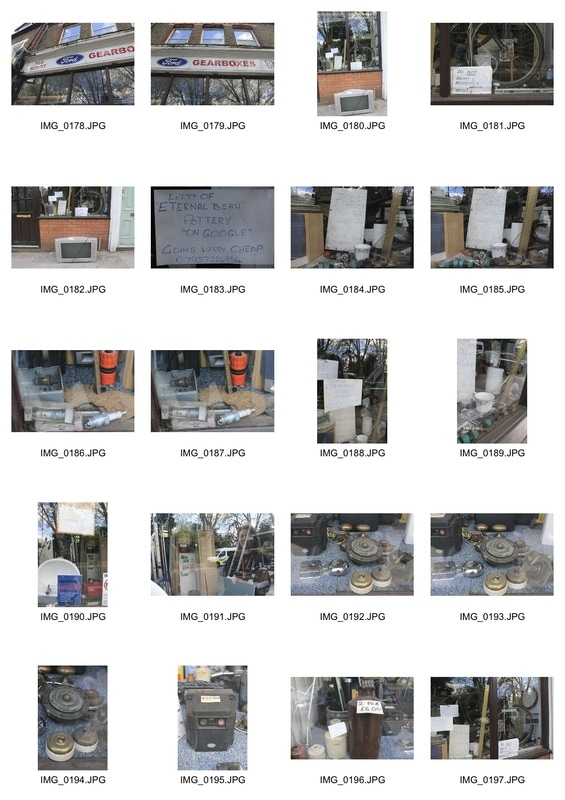
Gearboxes
I came across this shop whilst en route to the wood workshop. Although it wasn't open, there was so much to photograph in the shop window; it was packed with junk. Also, photographing through a window meant that reflections were formed on the glass, which was reminiscent of Atget's shop window series.
|
|
artist & me
|
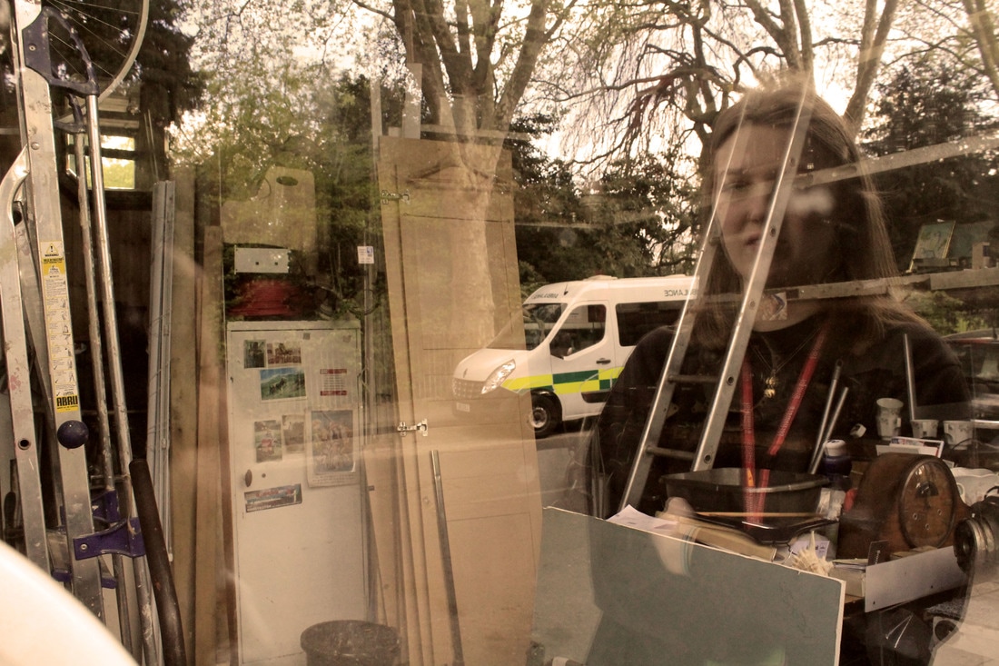
|
I chose to compare these two images as they have overlapping elements. Firstly, they both depict a shop window and the reflection of the outside world is juxtaposed on to the visible interior. I edited mine to replicate Atget's sepia tone, but mine is a more yellow hue than Atget's purple/brown. I think this is because of the camera and technique: Atget shot on film whilst I shot on digital and then edited in photoshop. Moreover, Atget typically focuses on mannequins; the element that the surrealists picked up on when reproducing his work in the 1920s. The interior of 'gearboxes', which I took pictures of, had planks of wood, ladders and general Also, the time difference between the two images is immediately obvious from the reflected surroundings; Atget's image depicts Paris in the early 20th century, whereas the ambulance in mine suggests the modern era.
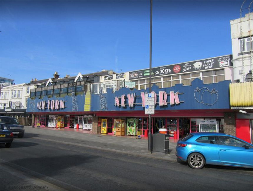
Arcade
Martin Parr
|
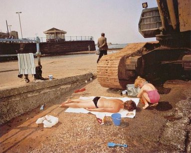
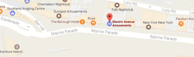
As a further development in my project of unusual and/or visually interesting environments, I visited an arcade in Southend. Arcades had always appealed to me artistically because of the unique light and atmosphere in there: it felt like stepping into a different world than the one outside. Specifically, seaside towns' arcades appealed to me because of their tradition in England. They remind me of Martin Parr's documentary photography in British seaside towns, in which he captures a lost sense of British summer tradition through a highly-saturated and slightly satirical lens.
|
my response:
|
When photographing the arcade, I again tried to capture the overall environment along with small details.
This was interesting as it was different to the traditional/old shops that I had been photographing due to the lighting and general atmosphere. |
God's Own Junkyard
After photographing the arcade, it reminded me of God's Own Junkyard, a unique warehouse in Walthamstow that houses a huge collection of neon signs and lights. This intensified the mood, atmosphere and lighting of the arcade.
Although these were striking environments to photograph, I feel that they don't fit the other shops that I've been documenting. Also, the arcade was in Southend, and I want to centre my project on London's forgotten spaces/shops.
|
'For every minute you are angry you lose sixty seconds of happiness‘
I met Charles Albert Lucien Snelling on a Saturday in April, 1992. He lived in a typical two up two down terraced house amongst many other two up two down terraced houses… It was yellow and orange. In that respect it was totally different from every other house on the street. Charlie was a simple, gentle, man. He loved flowers and the names of flowers. He loved colour and surrounded himself with colour. He loved his wife. Without ever trying or intending to, he showed me that the most important things in life cost nothing at all. He was my antidote to modern living.’ - Julian Germain In a series of photographs made over eight years, Julian Germain captured the quiet, contemplative existence of an old man living alone in a small house in a city on the south coast of England. Unfettered by the misplaced aspirations of the modern world, Charles Albert Lucian Snelling (Charlie) spent the last years of his life absorbed in his memories of his wife, his children, his love for flowers, music and the quotidian pleasures of the crossword, and his albums of his own photographs. Germain’s photographs of Charlie, his home and the things he owned are a beautiful, gentle portrait of a gentleman in his twilight years. |
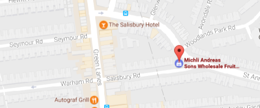
Michli Andreas & Sons
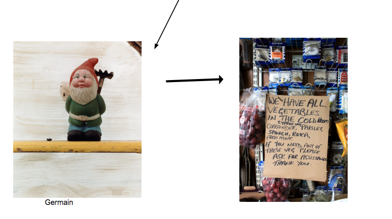
From my previous set of observations, I liked the images that showed details of an environment, like Germain's work, but also the sense of personalisation that shop owners sometimes unwittingly impose upon their shop. In this sense, they almost integrate into their environment, leaving them inextricably linked. I decided to visit a shop that encompassed both of these elements: Michli Andreas & Sons. This was in Green Lanes, further than the areas previously photographed and had a local reputation for its eccentricity. At the heart of this was Mr.Michli himself, owner of the shop who occasionally still works the shop with his children. Much of the produce was homemade on Michli's farm, and there are numerous odes to him throughout the shop.
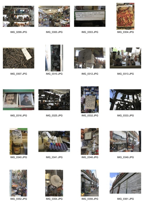
I was pleased with this set of images as I feel they capture the shop's uniqueness and character. Although Mr Michli was not there when I went, I was able to gain an understanding of him through the many photographs and artworks that had been done by other customers throughout the years. It was clear that it was a respected local establishment in the area. When photographing, I kept Germain's project in mind, aiming to photograph details that, on their own, could constitute an understanding of the overall environment. I found the many signs particularly interesting, as they encompassed the shop's character.
Having photographed over 10 different 'shop' environments, I feel I have built up a comprehensive picture of 'places of interest' in London that still possess a sense of being forgotten, or preserved in the past like Atget's work. Moving forward, I want to explore the relationship between the details of the shops I've photographed and their environment, or those who come into contact with them. This was inspired by the many notes and small pieces of writing scattered around Michli's shop, that enhanced its character and formed the basis of a narrative.
Having photographed over 10 different 'shop' environments, I feel I have built up a comprehensive picture of 'places of interest' in London that still possess a sense of being forgotten, or preserved in the past like Atget's work. Moving forward, I want to explore the relationship between the details of the shops I've photographed and their environment, or those who come into contact with them. This was inspired by the many notes and small pieces of writing scattered around Michli's shop, that enhanced its character and formed the basis of a narrative.
visual progress map
The Day to Day Life of Albert Hastings
|
Kaylynn Deveney is an American photographer who moved to Wales in order to attend photography school in 2001. In her project 'The Day to Day Life of Albert Hastings', she began documenting an acquaintance, Bert, gradually getting to know him. Speaking about her photographic technique, she expressed an intention of seeking the banal moments of the day—the experiences not usually considered significant enough to warrant a snapshot. She looks, too, for 'domestic patterns and practiced daily routines that make us feel at home or that confirm, or conform to, our ideas of what home should be'.
Early in this project Bert shared some intriguing thoughts and comments with Deveney concerning her portraits of him. These comments led her to think more about the ways their ideas regarding photography differed, and about how her perceptions of Bert differed from the way he saw himself. To better understand his feelings about being photographed and his reactions to my photographs, she asked Bert to caption small prints in a pocket-sized notebook.Bert’s captions create a new context for the photographs; while some correspond to the thinking that shaped the image, others interpret the image in a different way, thereby adding a critical second perspective to this work. |
my response:
In response to Deveney's work and inspired by the various notices found in Michli Andreas with details and handwritten captions, I went through my previous observations and selected my best pictures, or ones that specifically focussed on details of the environment. I then looked at them and wrote down a word, or a phrase that immediately came to mind. For some of them, this was something I'd heard whilst in that environment, which added a further element of personalisation to the images. With my captions, it imposed another meaning on to the images which I quite liked. Thinking about the captions forced me to consider and evaluate my images more deeply, thinking about different things within the images and how that formed the overall narrative of the image.
They also reminded me of the captions that Martin Parr used in his collaborative project 'Sign of the Times' (detailed earlier in the project) which were phrases from the person who's belongings/ environment was being photographed.
Continuing, I am going to photograph more shops and incorporate the note captions in to my next observations and hopefully my final piece. I want to synthesise all the elements of the project and different shops (including pictures and notes) into one cohesive body.
When I was thinking about the captions for the images above, I started thinking about their narrative, and thus the environment's narrative. It led me to consider another aspect of the shops I was visiting; their historical significance and story. To act on this development, I visited a number of old shops in the city of London that were long established or old family businesses. They felt very different to the shops I had visited previously, probably because they were immeasurably posher and appealed to an entirely different set of people in Mayfair. Since they were all stooped in history, I have included a brief history of the shops with my observations.
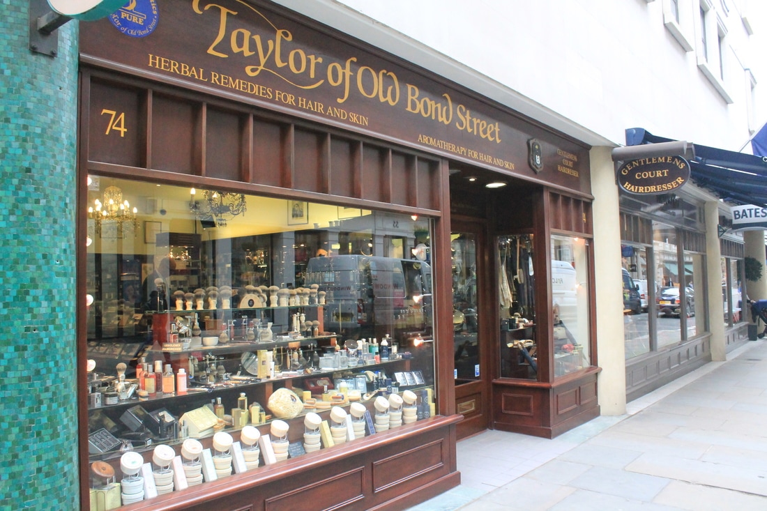
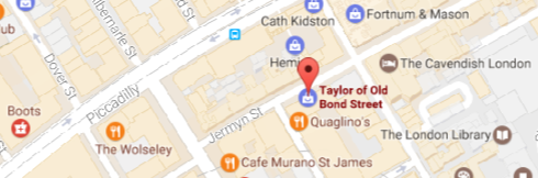
Taylor of Old Bond Street
|
Jeremiah Taylor first founded Taylor of Old Bond Street on September the 1st, 1854. Jeremiah opened his salon in London's fashionable Bond Street and gained a reputation in British Society for his botanical extracts. Since then, Taylor of Old Bond Street has become an established, exemplar salon, branching out into trading men's shaving equipment.
|
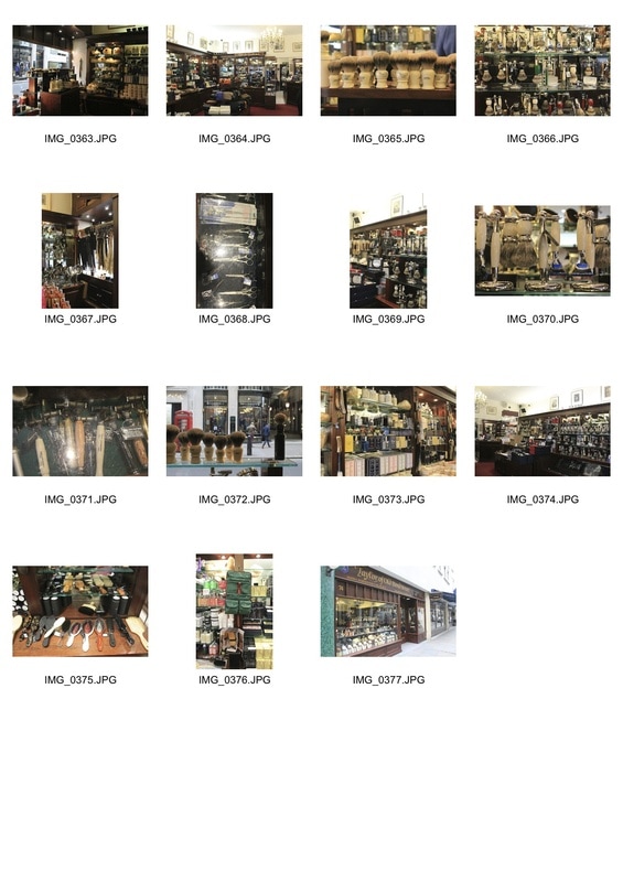
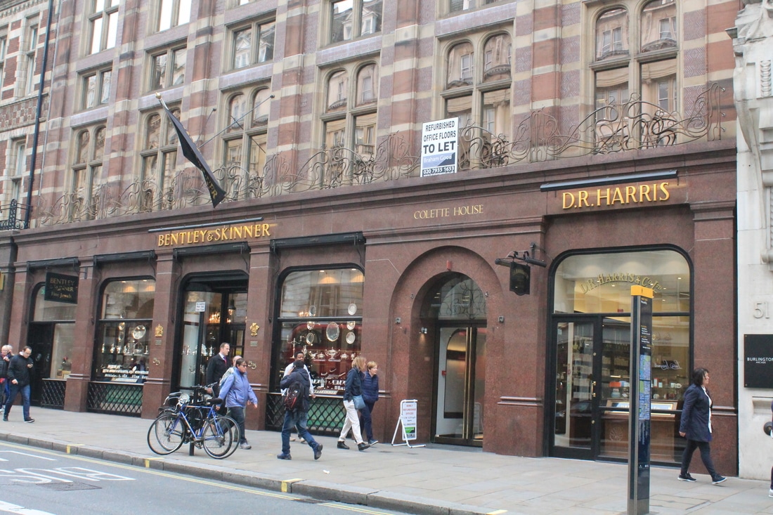
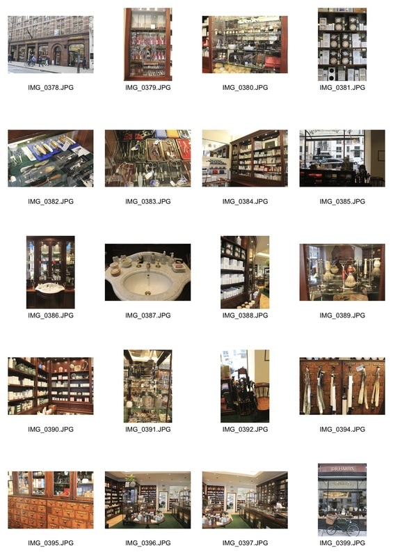
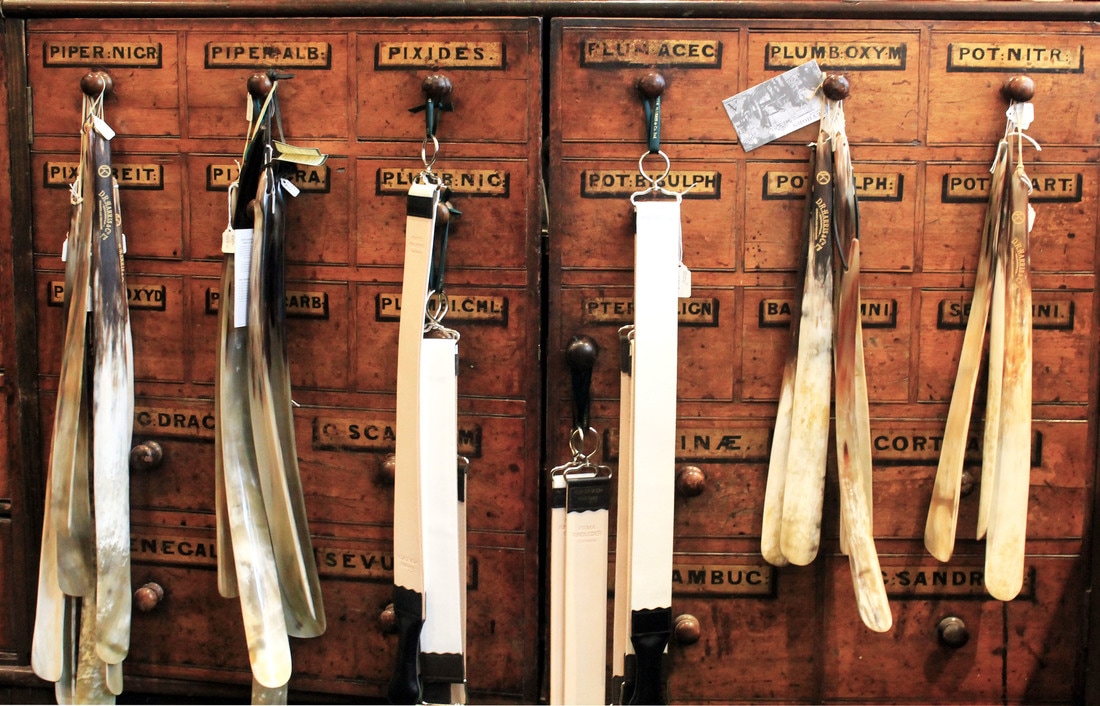
DR Harris & Co
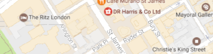
Harris's Apothecary set up shop in 1790. Over the next fifty years the family established a reputation selling Lavender Water, Classic Cologne and English Flower perfumes to this fashionable quarter of London.
For over two centuries this family business had served the gentry and in 1938 was awarded the warrant as chemists to her Majesty The Queen. Now, it consisted of a posh pharmacy. They still had the original drawers from 1790. |
|
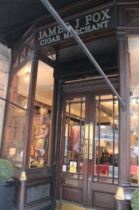
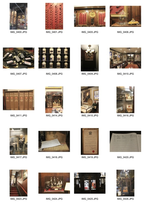
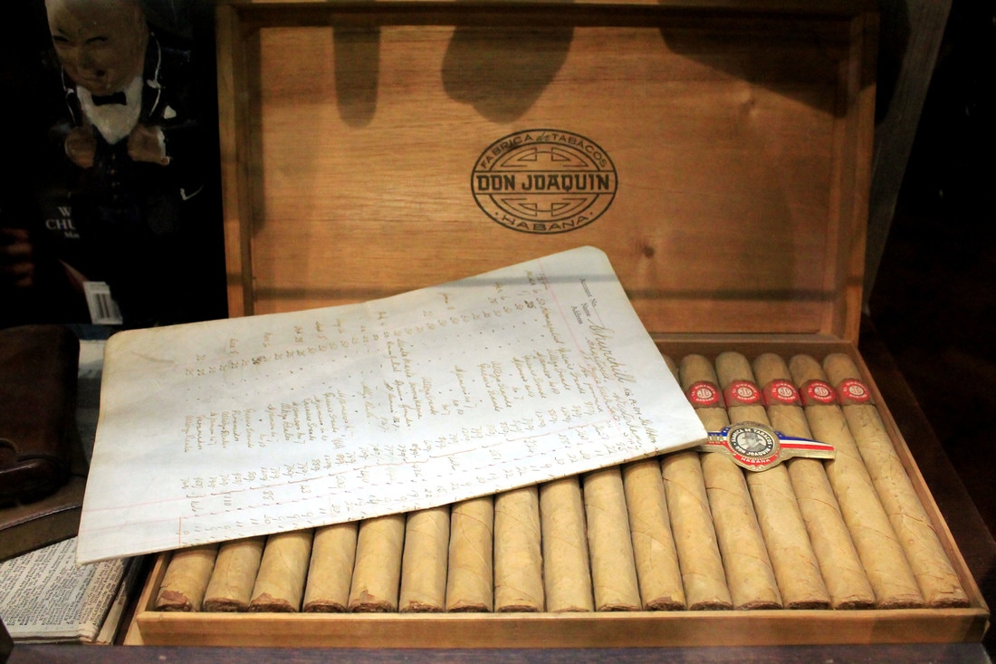
James J Fox
|
James J Fox has been trading in fine tobacco and smokers' accessories in this shop for over 225 years. Their customers have included 'discriminating smokers from all walks of life – from commoners to kings'. Among them have been Sir Winston Churchill, Oscar Wilde, and British and Foreign Royalty.
Now world-renowned as Churchill's personal tobacconist, it opened in 1787 to a very different London. It was a unique environment as you were still allowed to smoke inside, and it consisted of a shop, mini museum and smoking room. |
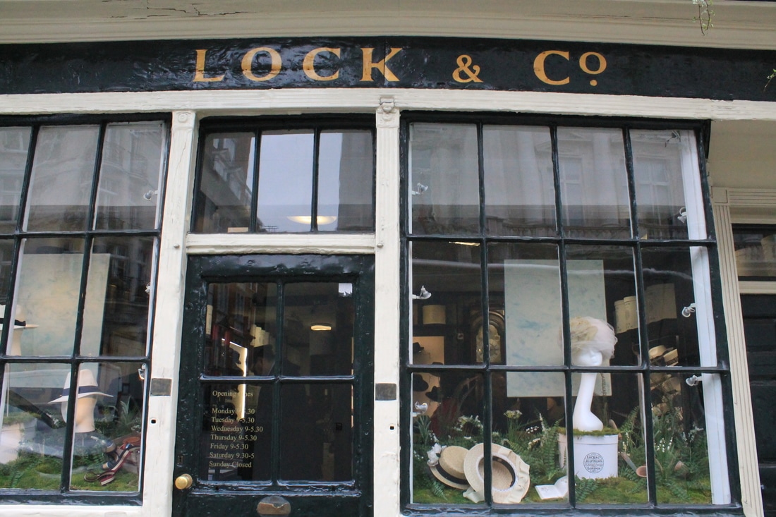
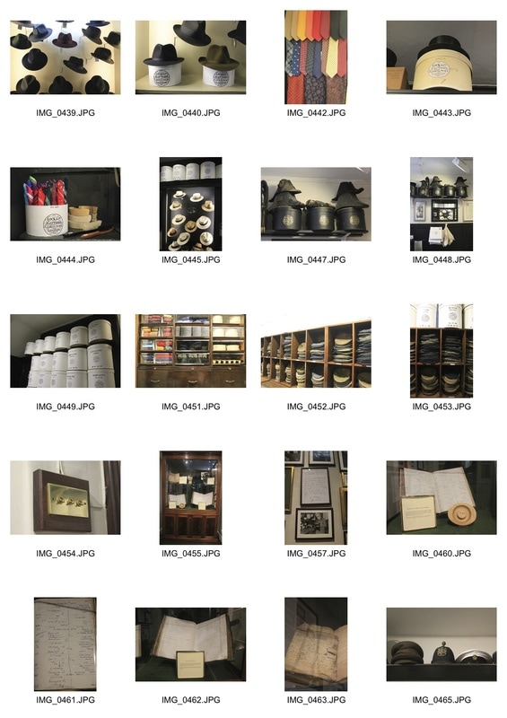
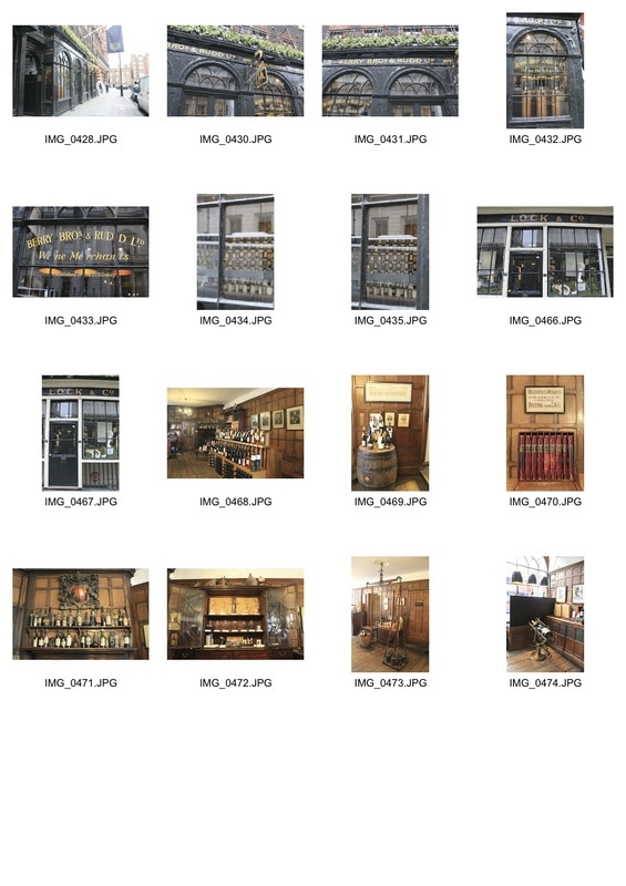
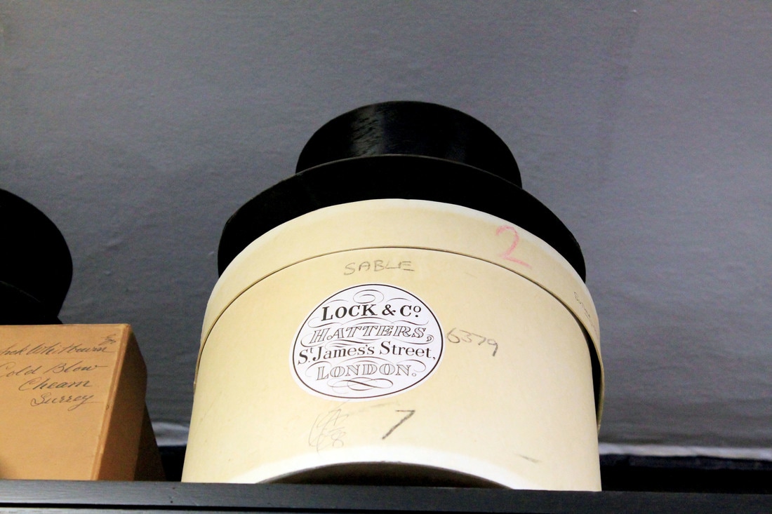
Lock & Co Hatters
|
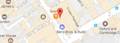
Lock & Co. Hatters is the world's oldest hat shop, the world's 34th oldest family-owned business and is a Grade II* listed building.The company was founded in 1676 by Robert Davis. His son Charles continued the business and took James Lock (1731–1806) on as an apprentice in 1747. James later married Charles Davis's only child, Mary. When Davis died in 1759, James Lock inherited the company from his former master, and the Lock family, James's descendants, still own and run the company today. The shop has been in its current location since 1765.
The company is responsible for the origination of the bowler hat and is a Royal warrant holder as Hatter to Prince Philip and Prince Charles. |
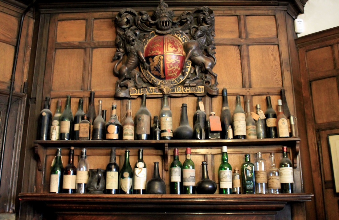
Berry Bros & Rudd
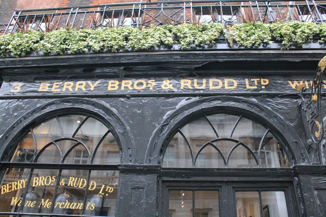
|

Berry Bros. & Rudd is Britain's oldest wine and spirit merchant, having traded from the same shop since 1698. In 1698, the Widow Bourne established a shop at No. 3 St James’s Street. Over three centuries later, with two Royal Warrants and seven Masters of Wine, the family business continues to flourish.
Aesthetically, this was very obviously an old and established business which was interesting to photograph. |
Photographing this set of shops in Mayfair, I felt their wealth was very apparent in the decor, products and atmosphere. It provided a stark contrast to the more local, cluttered shops I had visited. In all, they provided an alternative interpretation to the idea of old and well- established environment.
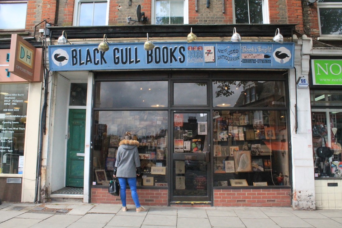
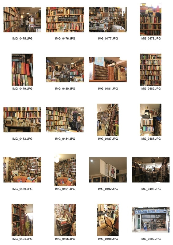
black gull books
|
Lastly, I chose to visit Black Gull Books in East Finchley. I wanted to focus on the clutter/ disorganisation of the books in the same way as I focussed on the detail in the Mayfair shops. I feel these were successful as through photographing all the different shops I've found it easier to pick out interesting compositions within a bigger frame.
|
visual progress map
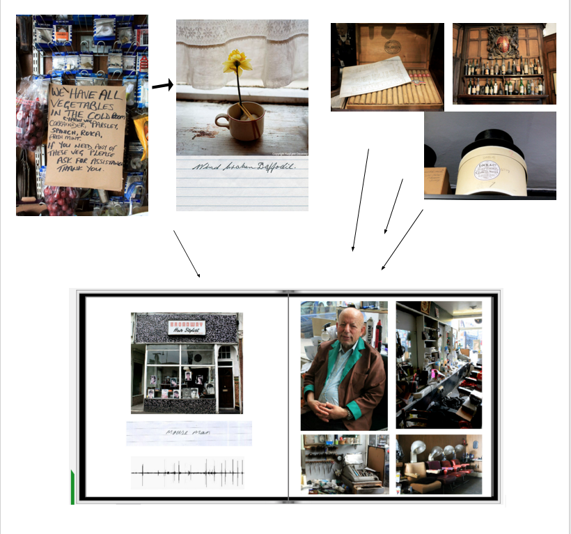
final piece
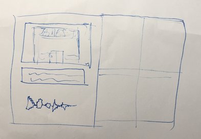
an initial sketch of what the book would look like
For my final piece, I decided to combine all of the elements of my project into a photobook. This would include my best pictures from my best sets / shops, a picture of the shopfront to contextualise the images, a 'caption' - handwritten by the shopkeeper and often a quote heard in store, and a waveform of a voice memo recorded in the shop. I thought this would be good to include as it added another element to the environment - its sound. However, since the actual audio files were not very interesting (and in some cases, silent), I felt it was better to convert them into a visual representation of themselves- waveforms.
|

the voice memos, and their waveforms
|
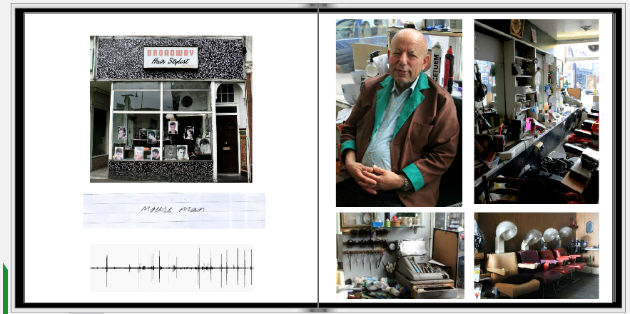
example of a double page spread in the final book
To achieve my final piece, I used an online mp3 - wav converter to produce a visual image of the voice memo recorded in the shop. I then scanned in the caption/ note which was sometimes anecdotal or a quote I had heard whilst in the shop or talking to the shopkeeper. I chose 4 images from the shop to put on the opposite page.
I liked how it seemed to bring all the experimental elements of the project into one coherent body of work, showing the visual elements of the shop (like Atget and Londei) alongside the sonic and more personal touches (inspired by Kaylynn Deveney) I encountered. I chose my 10 favourite shops from the project that fit together- I omitted the non-London environments - to include in the book, and titled it 'Preserved Places' as it ultimately depicts the forgotten, preserved and established environments in London.
In my exhibition space I am going to have the book on a plinth, with an accompanying print from each shop I've been to. They will be A4 and mounted on foamboard.
|
|
|